
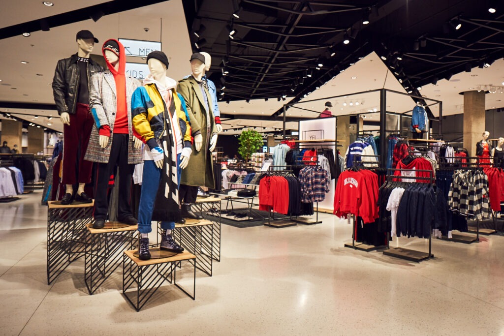
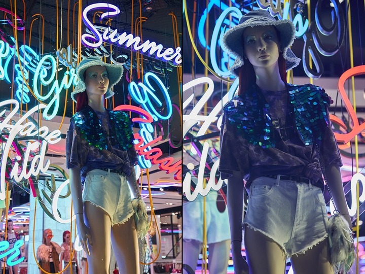
Retail Design Blog
Our Retail Design Blog contains the latest trends & ideas in retail and is solely dedicated to retail design & display. We’ve collated the projects we found most useful for our own retail designs and visual merchandising projects, with a range of applications that can come out of the ideas seen below: lighting design, modular structures, bespoke displays and much more. We aim to keep our Retail Design Blog as useful as possible, and if you’d like to let us know about a project please feel free to get in touch. Alternatively, if you’re looking for exhibition stands design ideas, we have another blog for these here.
Jump to a specific month:
2019: January February March April May June July August September October November December
2018: January February March April May June July August September October November December
2017: January February March April May June July August September October November December
2016: June July August September October November December
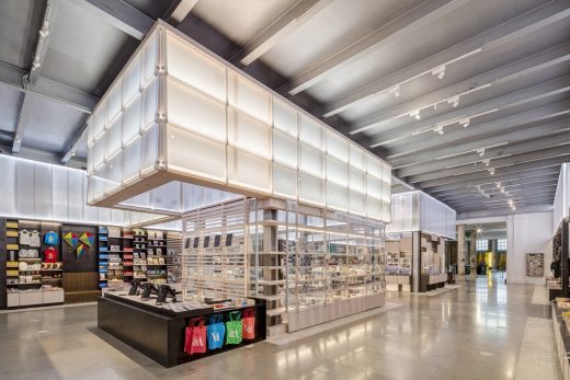
Nu Skin
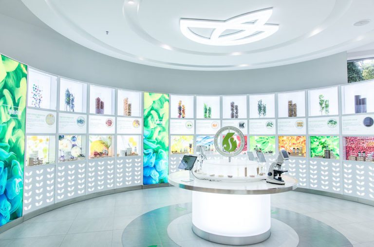
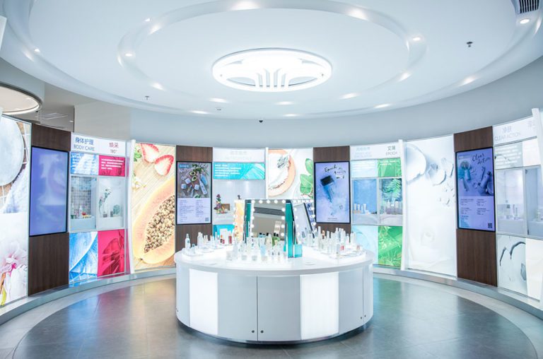
Health and beauty company ‘Nu skins flagship’ emphasises the importance of individual beauty and self-care. Notice how they use light to their advantage in order to highlight their products and draw customers in. This use of design along with colours and lighting really reflect that of their brand.
See the full project https://locationinsider.de/nu-skin-verbindet-schoenheit-mit-technik/
Dyce
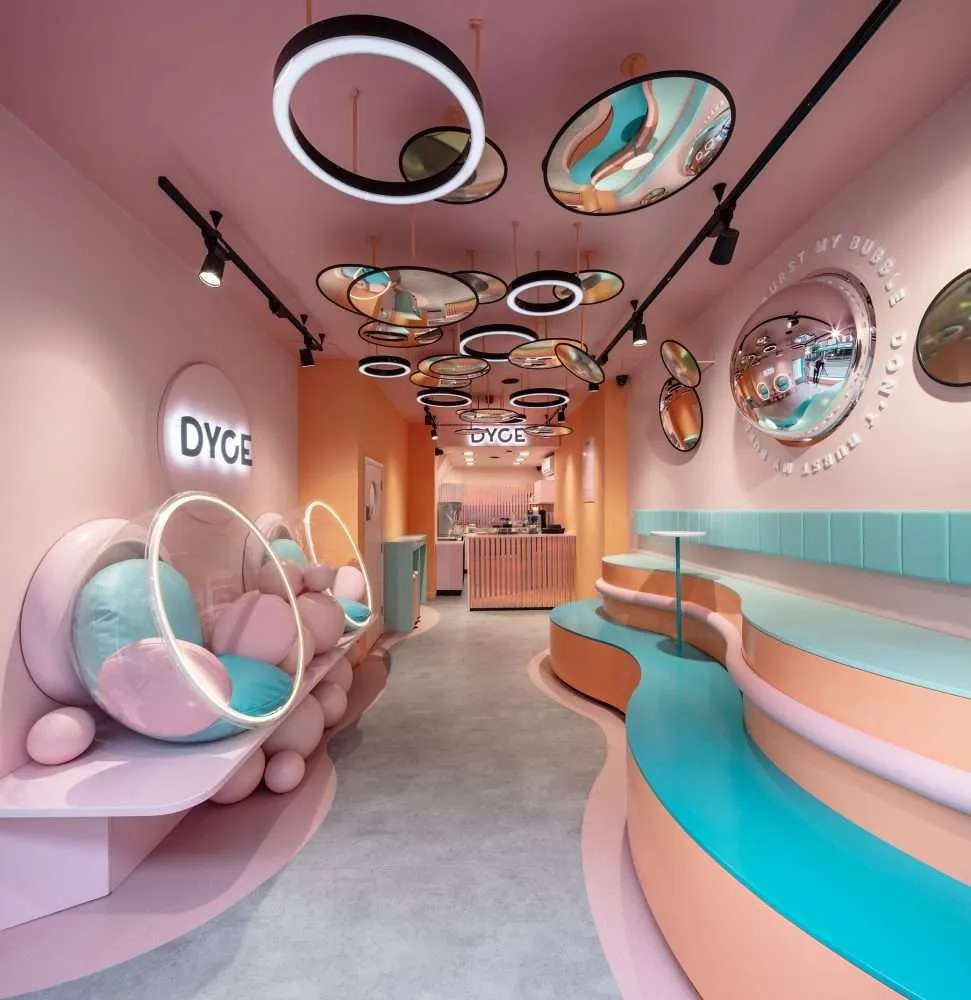
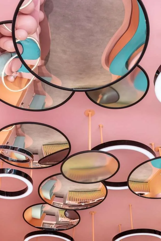
The icecream store ‘Dyce’ creates an allusive, fun and welcoming experience for those visiting. With using on-trend bold shapes, textures and pastel shades to create an ‘instagrammable’ atmosphere for online social media channels. Notice how this store effectively uses LED lights around the hanging mirrors to create dimension to their store.
See the full project https://www.formroom.com/commercial-interior-design/restaurant-cafe-interior-design/dyce/ Photography by Marcus Peel
Dalziel & Pow
Dalziel & Pow’s design concept for Centrepoint’s new store in Dubai, captures the essence and presence of what a store should look like in order to draw customers in. Their captivating display of lighting and graphics create a welcoming environment. They also explore the use of the on-trend cinematic lightboxes which allows you to change the wording to present a different message whenever you like!
See the full project https://retaildesignblog.net/2019/10/17/centrepoint-by-dalziel-pow/
Basler
Basler’s showroom in Dusseldorf shows how well you can incorporate all elements of the fashion into a shopping experience for customers, from behind the scenes glamour to the models walking at fashion shows and the product itself. The layout of the space creates a luxurious and glamourous experience which is paired well with the elements of lighting and shimmering fabrics on the walls to truly capture the quality of their brand.
See the full project https://retaildesignblog.net/2012/04/24/basler-showroom-by-blocher-blocher-partners-dusseldorf/ Photography by Klaus Mellenthin
Beauty Bakerie
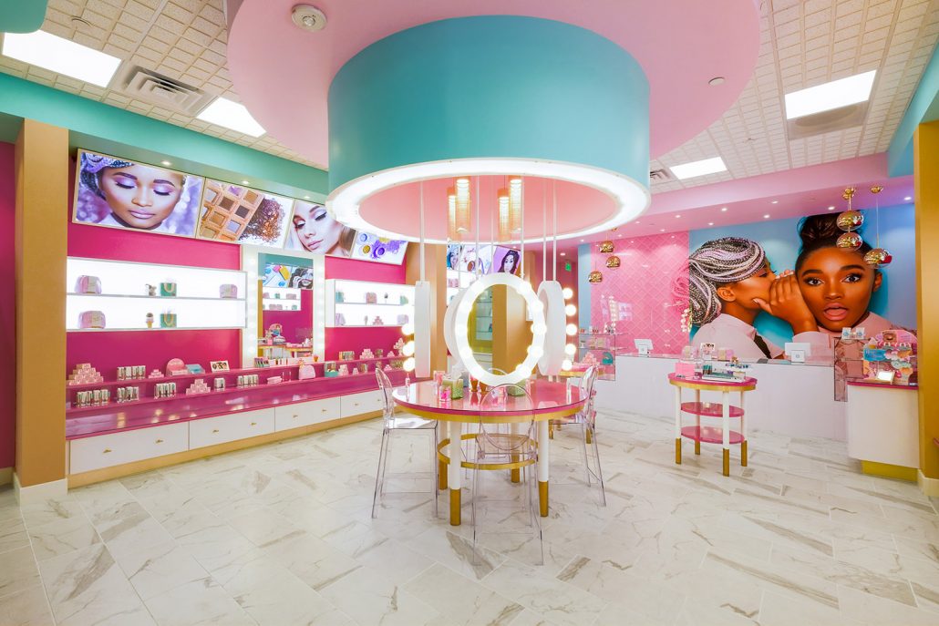
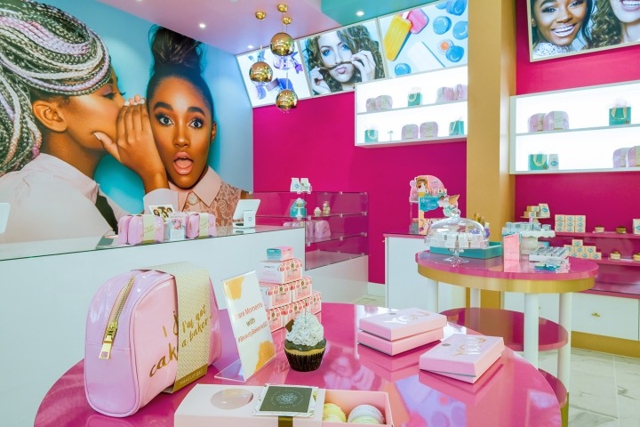
Beauty Bakerie cosmetics store in San Diego explores how colour can really create a positive and inviting atmosphere to engage customers and create a welcoming experience.
The centrepiece of the room embodies that of a dressing table for customers to try out their products before purchasing. The exploration of different concepts of lighting in the mirrors, shelves and posters is a clever way of focusing the visitor’s attention on the products.
See the full project https://mindfuldesignconsulting.com/gallery/
Brosway
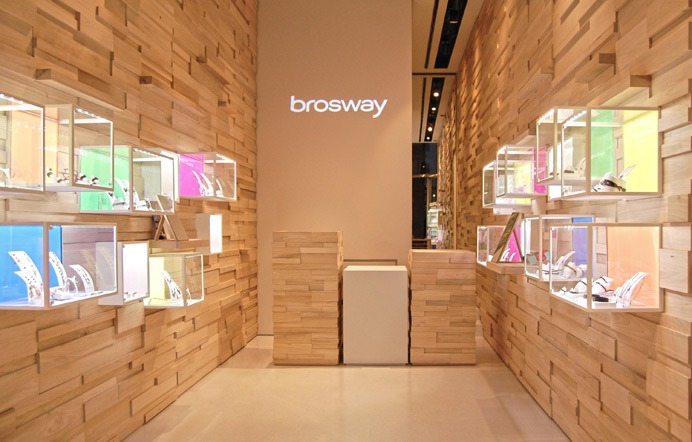
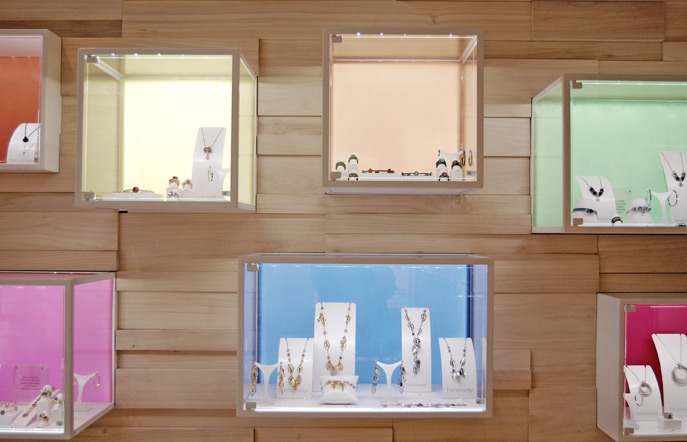
Brosway, the Italian fashion jewellery brand has recently refurbished its store in Milan, illustrating the importance of colour, lighting and natural materials. The geometric pattern creates a different concept of definition to highlight the products. The backlit cases and colour attract visitors to the product itself which is complemented with neutral feature walls.
See the full project https://www.giovenali.net/en/realizzazioni/brosway-milano/
Louis Vuitton Pop Up
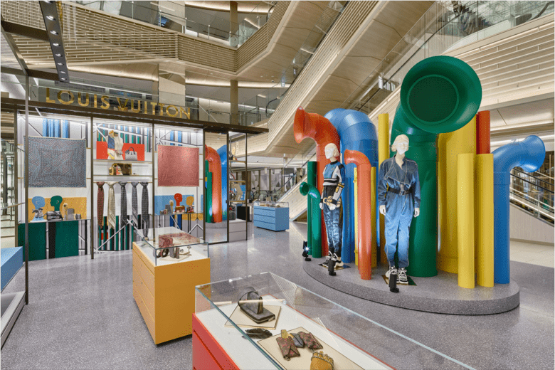
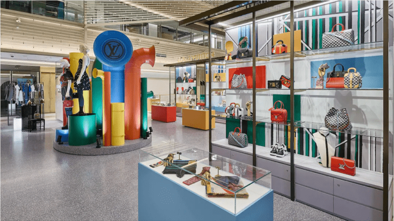
Louis Vuitton’s latest pop in Japan is the perfect example of how effective temporary displays can be. Their ephemeral display uses colour to draw the visitor in, with shades paired with products in an effort to contrast against one another, and elegantly printed glass cabinets housing smaller items.
And of course the centrepiece proves to be an unmissable attention-grabber, setting the utilitarian theme for the pop-up.
See the full project https://retaildesignblog.net/2019/08/02/louis-vuitton-pop-up-store-2/
Optique Moitzheim
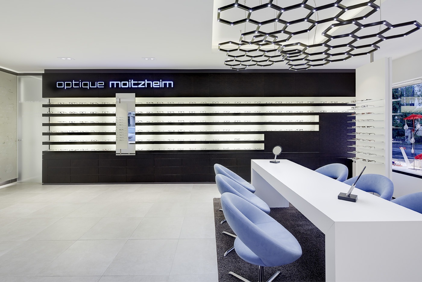
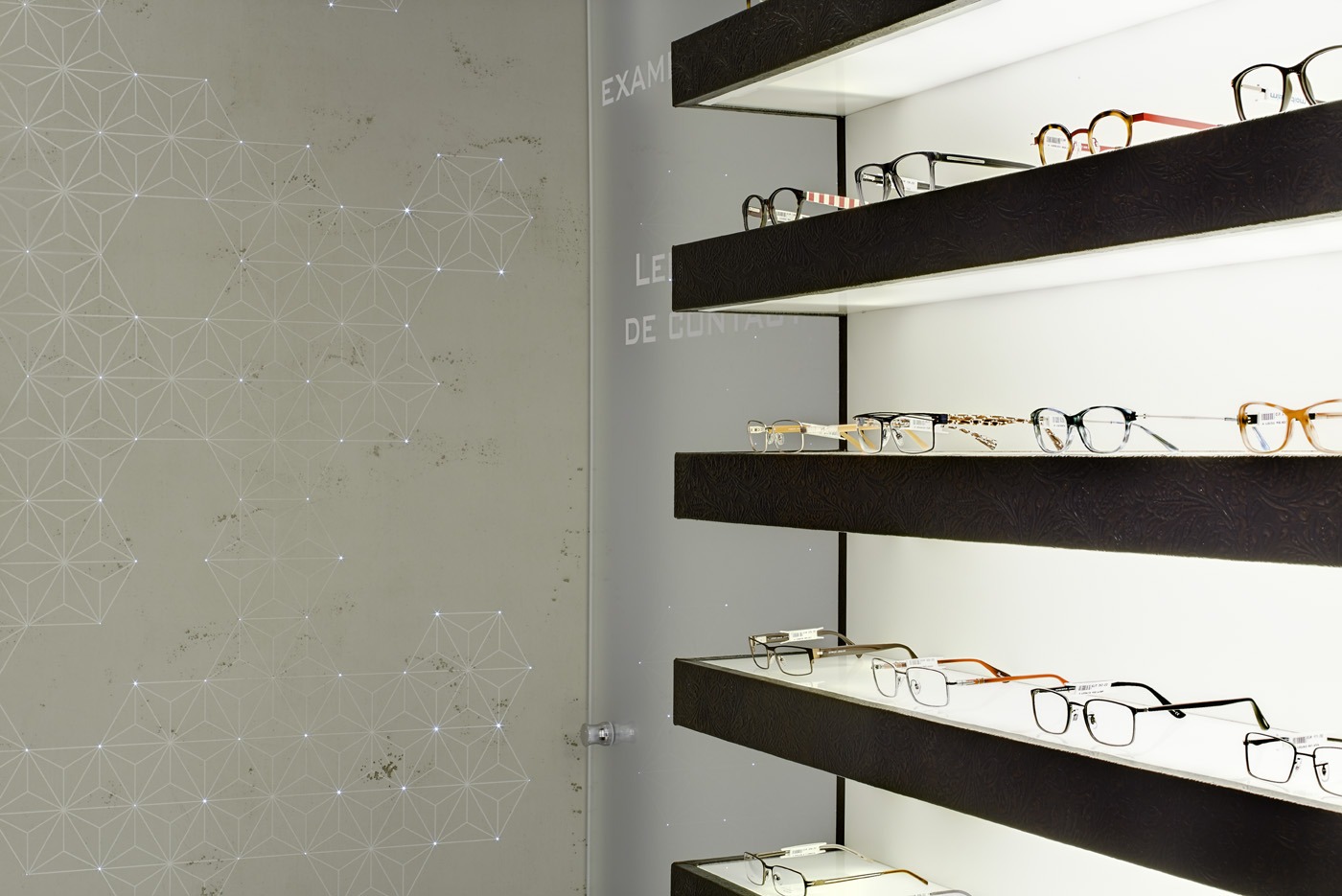
Optique Moitzheim’s store in Luxembourg illustrates the importance of effective lighting. Whilst the ambient lighting is, of course, a factor, we can’t help but be drawn to the product display lighting, which takes an illuminated panel and sits it behind a light-grain wooden finish.
With no fixtures or fittings in sight, this application of lighting focuses the visitor on the products and nothing more – creating an ideal retail environment.
See the full project https://www.heikaus-retail.com/projekte/optique-moitzheim
Ardene by Dalziel & Pow
Ardene’s store revamp, courtesy of Dalziel & Pow, portrayed a central mission of “Never Stand Still, Attainable Style, Limitless Inspiration”.
Now, readers in the UK may be aware of how D&P’s designs have helped bring retailers to the forefront, particularly in Missguided’s launch on the high street. Ardene’s store is no different.
D&P have used colour to great effect, with the subtle monochrome finishes making the store inviting, before attracting attention with a bold colour palette for signage and displays.
See the full project https://www.mind-mag.com/retail/ardene-targets-gen-z-in-saint-jerome/
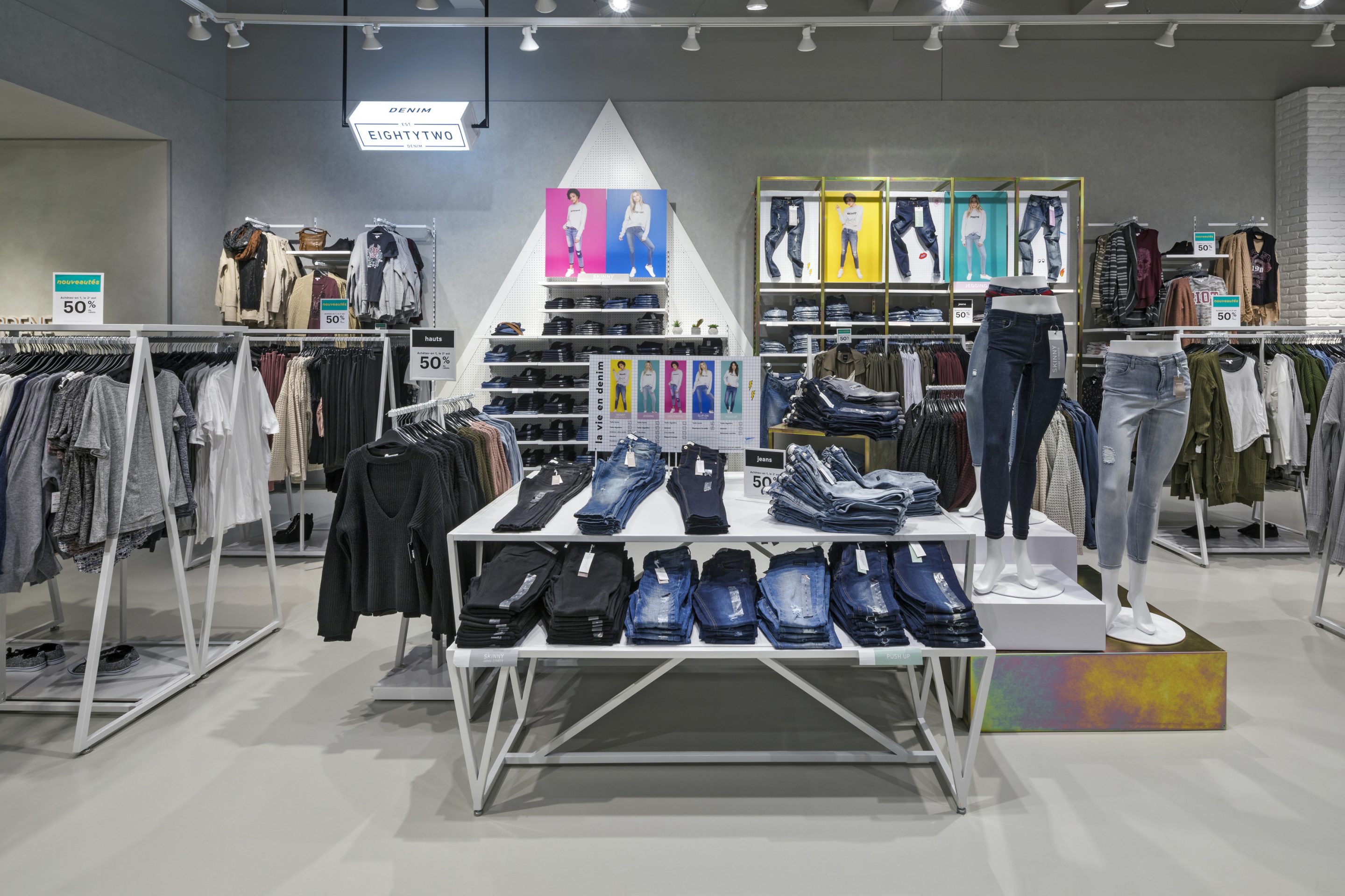
Slam
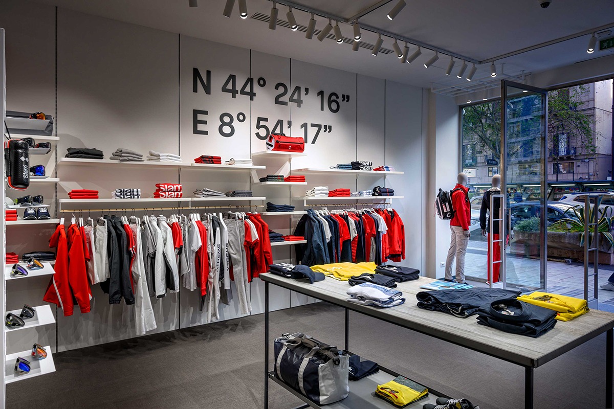
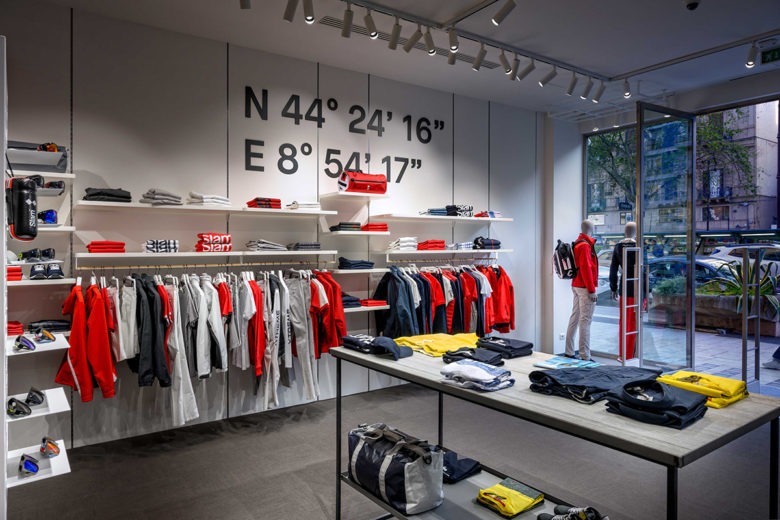
Slam have taken a modular approach to their store design in Palermo, designed by Wea. We particularly like how Slam’s merchandise system reaches from floor to ceiling – something rarely seen in retail displays like this.
The elevated top row of merchandise allows light to enter through the display, meaning although there’s plenty of products on display, the shopper doesn’t feel overwhelmed.
See the full project https://wea.it/2019/04/30/slam-flagship-store-palermo/
Dior
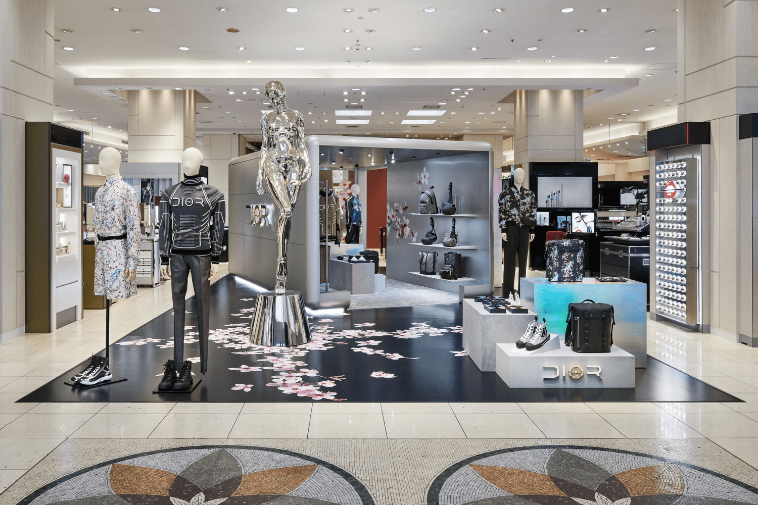
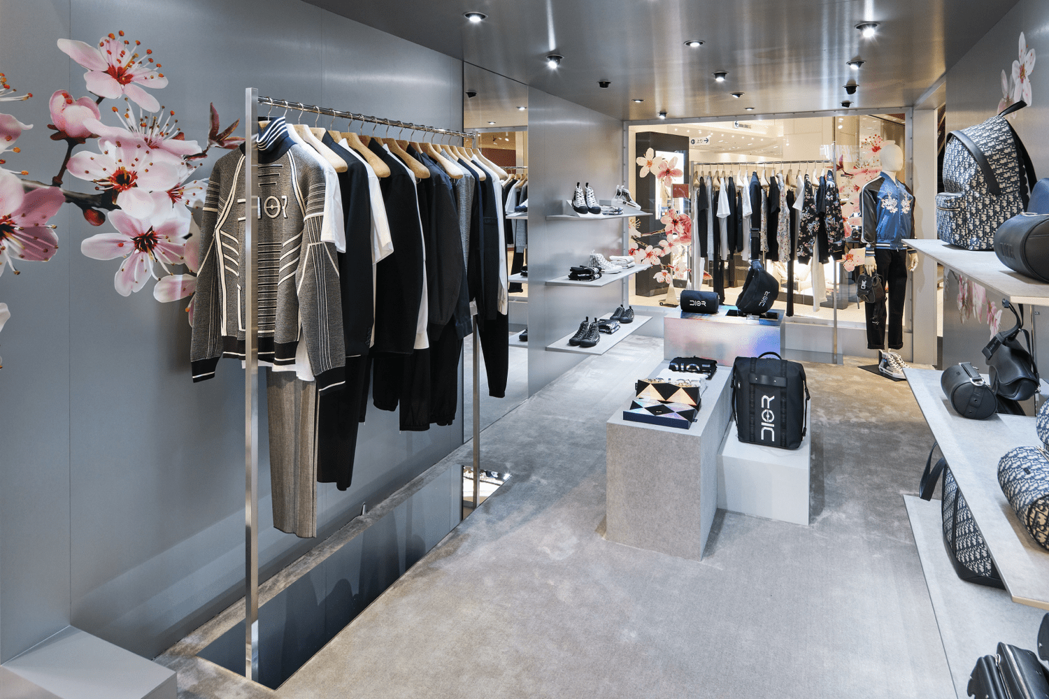
Dior’s pop up in Fukuoka City, Japan, shows how well a design intent can translate to in store display. Launching in November last year, the futuristic collection has been expertly recreated within the department store.
The walk-in element shows how an experience can be creative whilst retaining the merchandising elements needed within a pop up – effectively illuminated shelving, and an elegant clothing display surrounded by matte-effect grey exterior.
See the full project https://superfuture.com/2019/05/new-shops/fukuoka-dior-pop-up-store/
The School of Life
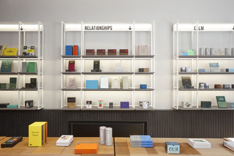
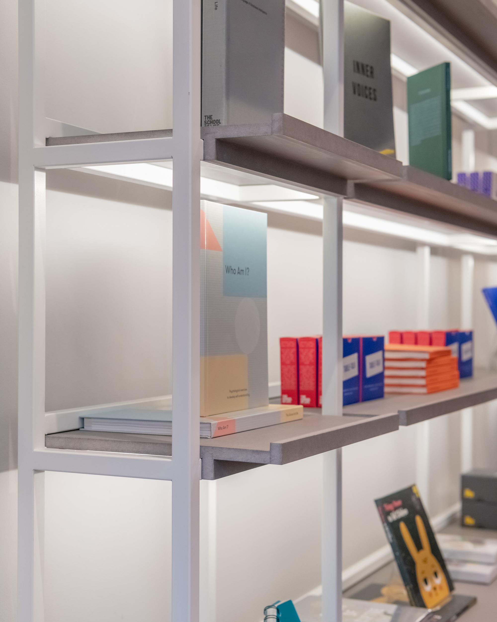
We’re champions of effective lighting in shelving displays, and the recent design by A Shop for Life, designed by Sash Scott & Tamzin Hanke, does a great job. While there isn’t anything complex about this application, the white-coated framework works perfectly against the slate finish shelves, which when illuminated creates a bright, vibrant display.
This also demonstrates the importance of lighting each shelf, elegantly hiding the illumination within the framework itself.
See the full project https://thiss.works/theschooloflife
Juhasz
Juhasz’s store, by blocker partners, describes itself as a fashion store with bohemian charm. The natural finishes and textures used as an integral part of the store design create a luxury feel, working seamlessly from matte black frameworks to aged wooden plinths.
The exposed brick, untreated wood and seemingly unfinished concrete flooring create a true retail experience, one that remains in the memory of shoppers.
See the full project https://blocherpartners.com/projekte/trade-culture/juhasz-bad-reichenhall
Starbucks
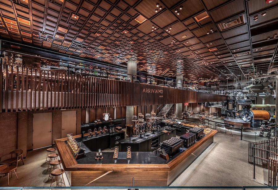
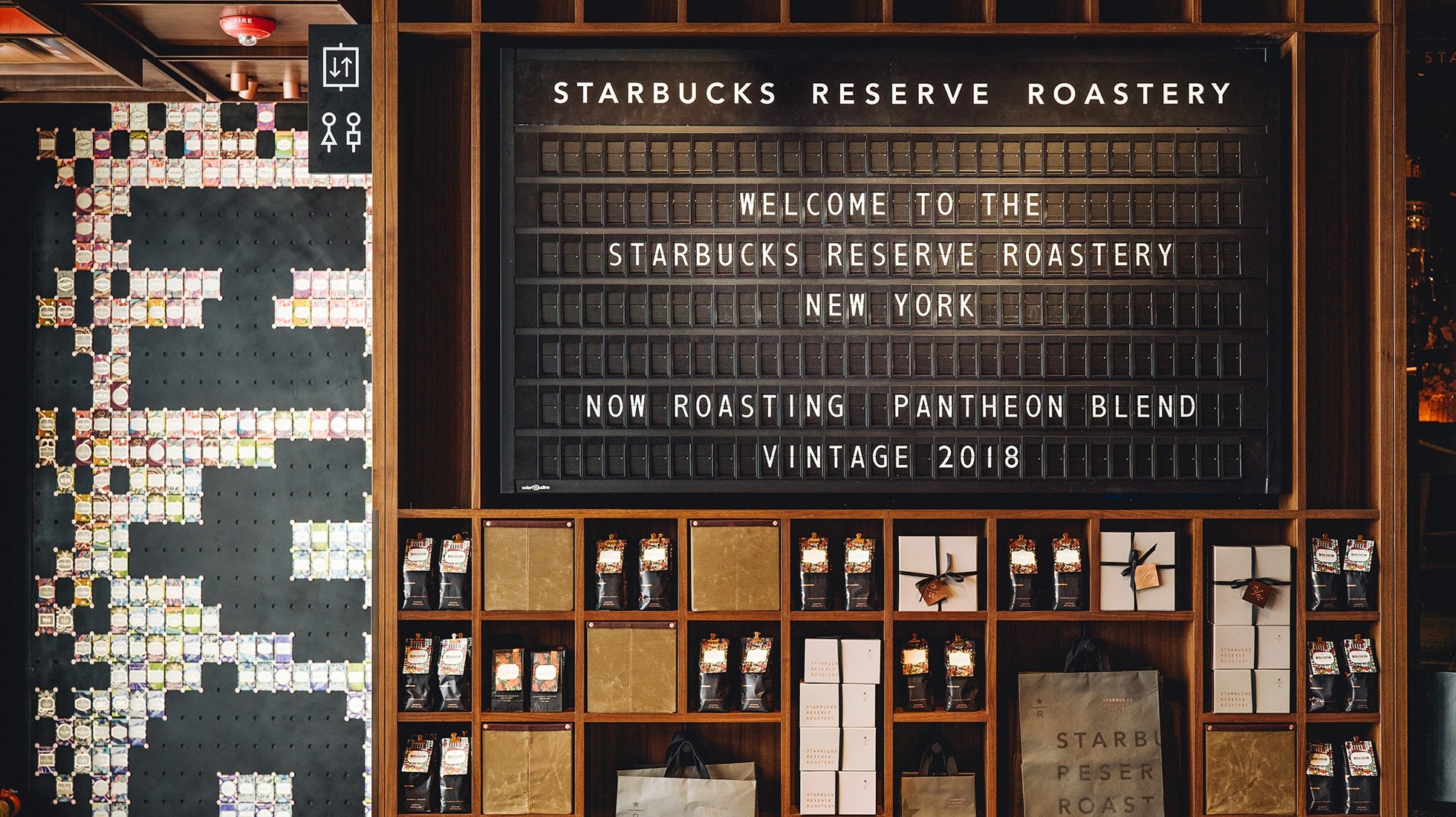
The new Starbucks Reserve Roastery is certainly a change in the concept of the usual hipster hangout. Designed to embody the bustling spirit of New York City, the new space is a fully working coffee roastery, where the infrastructure needed to run this operationally is designed around the customer areas.
In a world where we’re used to seeing interior designers turn to minimalism, this is an incredible juxtaposition. It’s customer experience in itself, without needing to think about a retail design scheme – the roastery does all of the work for Starbucks.
We particularly like the ticker-tape style finish on the signage – a nice touch.
See the full project https://www.starbucksreserve.com/en-us/locations/new-york/highlights https://www.forbes.com/sites/karlaalindahao/2019/03/30/best-cocktails-at-starbucks-reserve-roastery-arriviamo-new-york-city-2019/
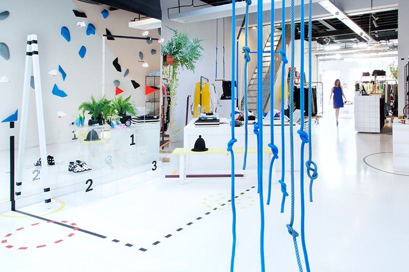
Next’s Feel Good Gym
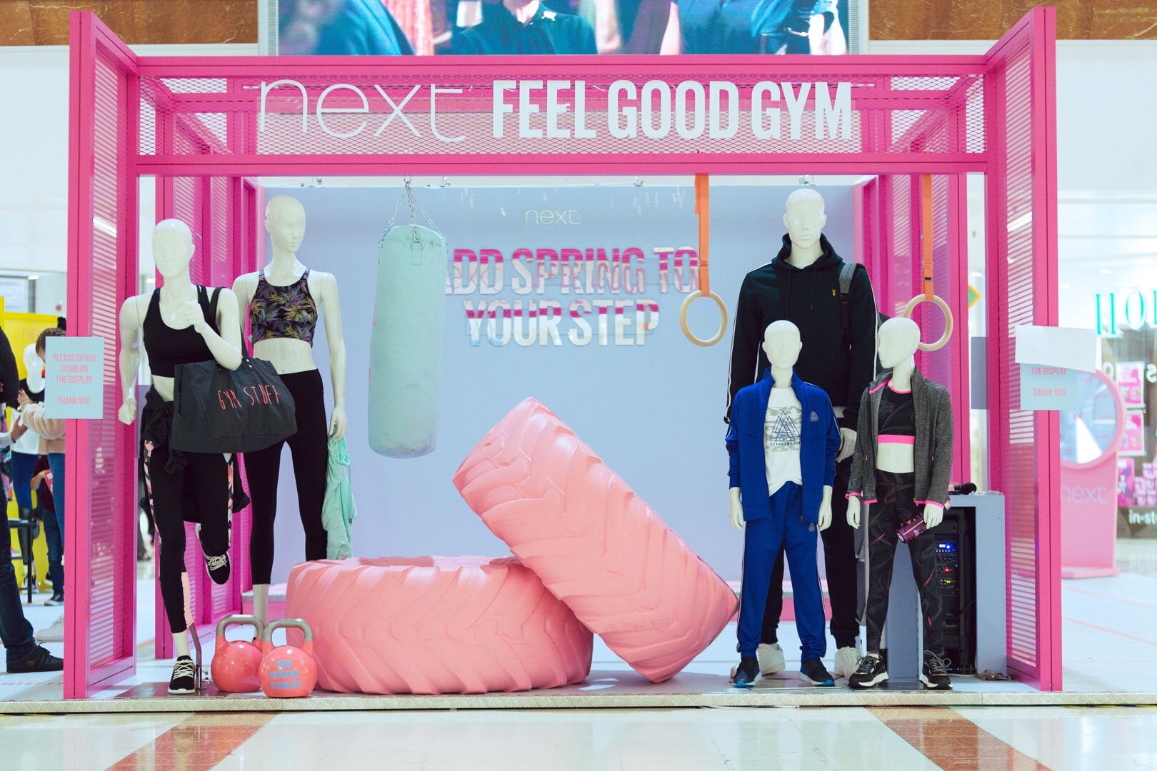
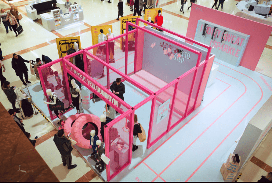
Next’s Feel Good Gym installation is an incredible concession display within intu Merry Hill. Not only is the message positive, it shows how a simple structure can be transformed by its use of colour.
The main gym structure, surrounded in bright fuchsia modular profile with mesh inserts looks amazing. One of the common questions we hear is whether there is a way to make modular aluminium profiles more visually exciting, and this is the perfect answer. It’s an easy process to add custom colours to the profiles themselves, meaning a concept as strong as this looks fantastic.
See the full project https://backlash.co.uk/work/next-feel-good-gym
Virgin Holidays
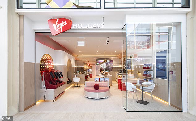
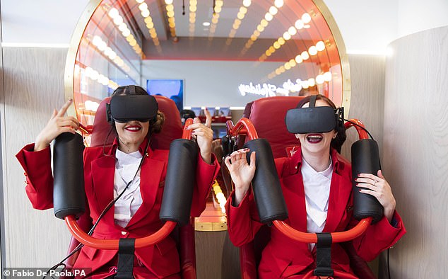
Customer experience is one of those concepts that is difficult to explain until you experience it. Virgin Holidays new location is the embodiment of experience, transforming their store in Milton Keynes into a try-before-you-book flight experience.
The store hosts a range of different features, from sample business class, first class and premium economy seating, to a virtual reality roller coaster.
The end-goal throughout all of this is to provide customers with a great feeling when it comes to Virgin’s brand. They recognise that Virgin will provide them with the same great experience during their flight, leading to further bookings – or even bookings in store.
See the full project https://www.dailymail.co.uk/travel/travel_news/article-6372283/Virgin-Holidays-opens-travel-agent-shop-Milton-Keynes-spa-business-class-seats.html Photography by Fabio De Paola
Maison Kitsuné flagship store
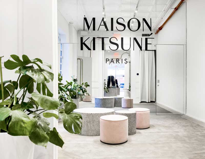
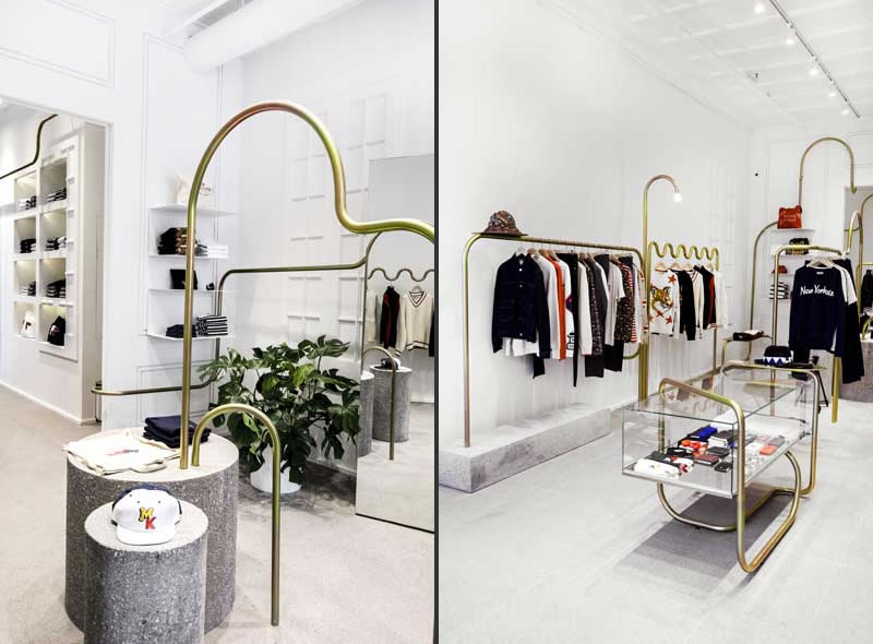
Maison Kitsuné, the French founded fashion and electronic music label asked designed Mathieu Lehanneur to design its flagship store in SoHo. Designed to create a strong visual statement that evokes feelings of Paris, New York and Japan, the space features high-ceilinged rooms, a snaking chrome steel display and neutral monochrome colour schemes.
The simplicity of the stores white wall and bright lighting gives the space a high end luxury feel that resonates on the brands Parisien background.
See the full project https://www.arredanegozi.it/2018/03/maison-kitsune-new-york-flagship-store/
Victoria’s Secret Pink
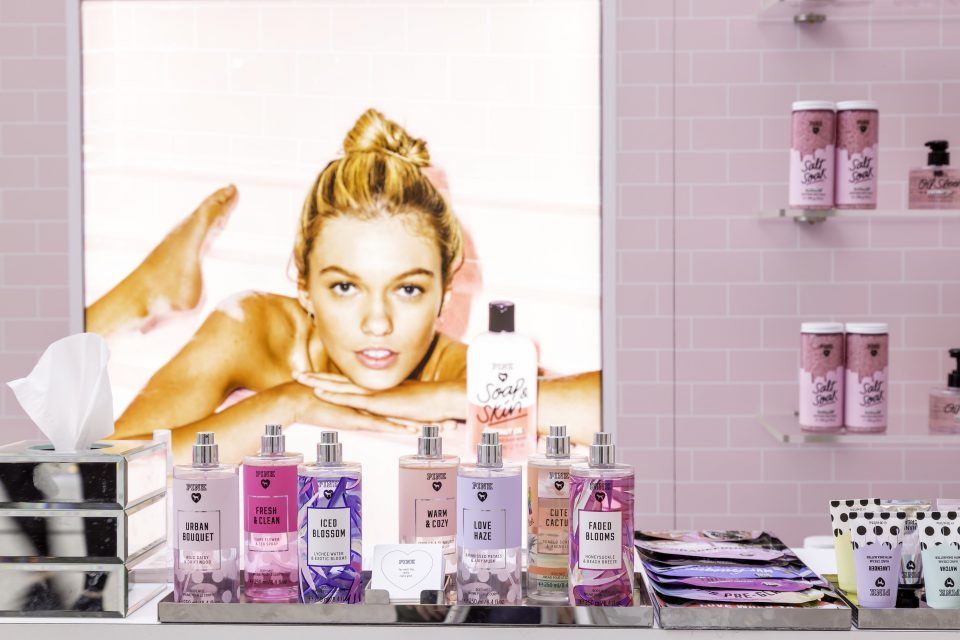
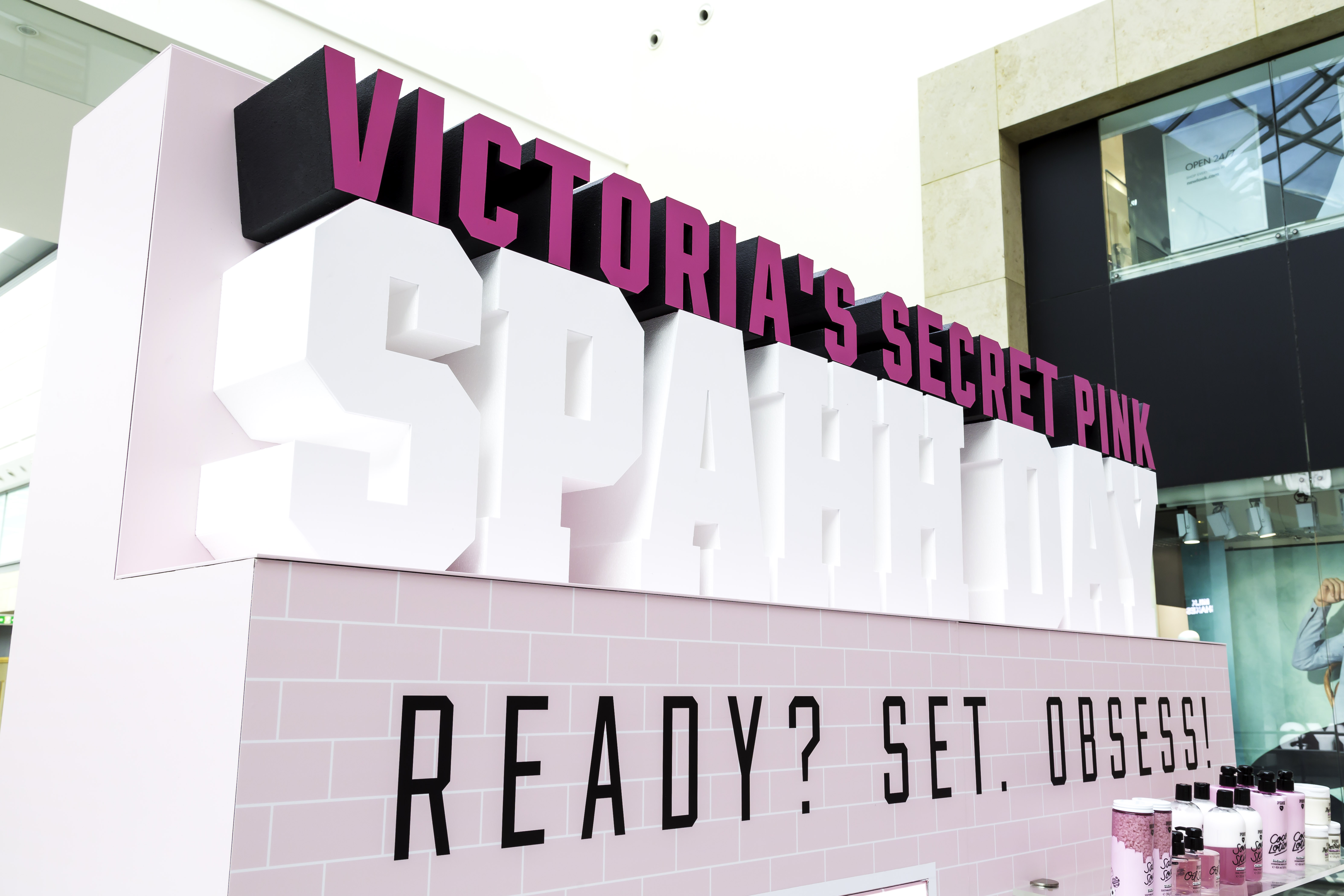
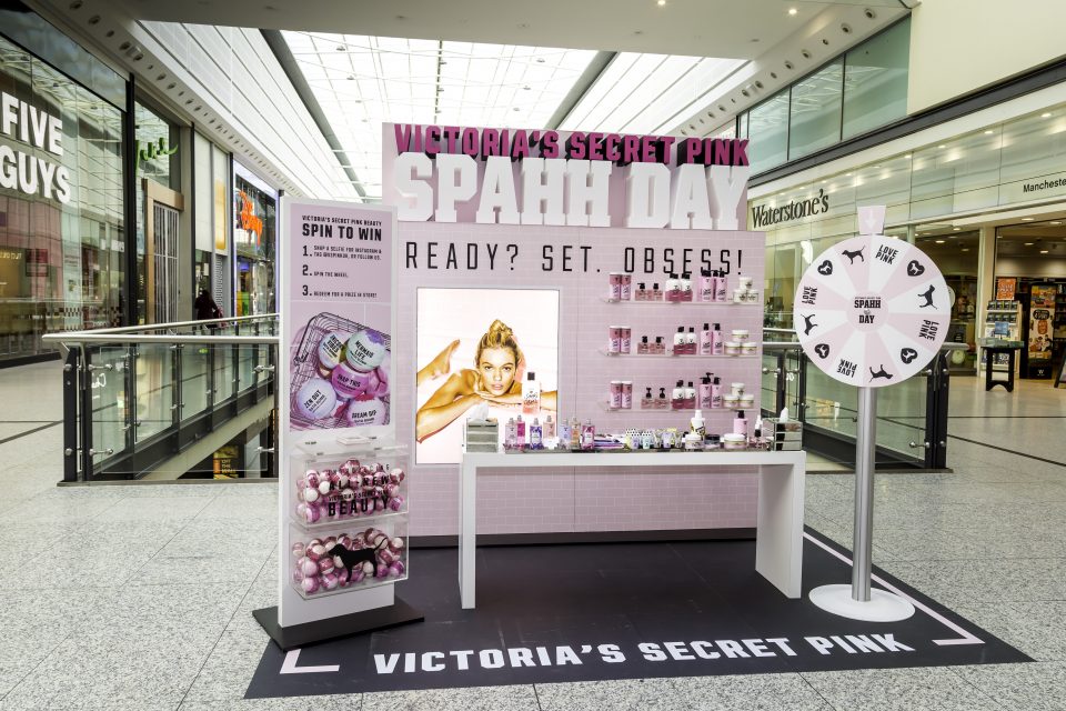
Victoria’s Secret needed help promoting their ‘Pink’ beauty range, for this help they went to Lucky Fox who created the Victoria’s Secret Pink Spahh Day pop-up stand.
The stand was split into two sides, with one side of the stand displaying the products and the other featuring a selfie wall. The pop-up also featured a giant spinner where customers could spin the wheel to wind products from the ‘Pink’ beauty range.
See the full project https://luckyfox.uk.com/projects/victorias-secret/ Photography by James White
Brown’s
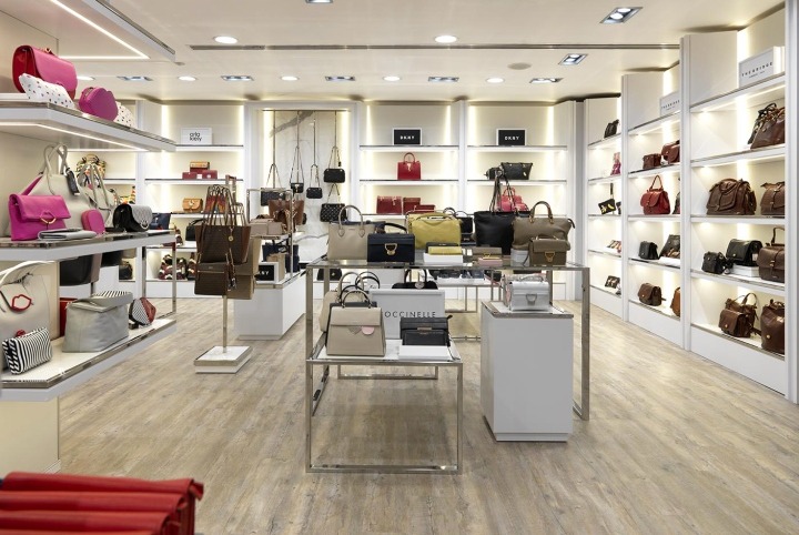
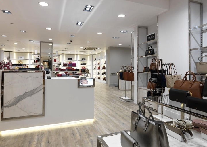
Independent York based department store Browns tasked design agency EDP to design a new ground floor handbag department.
The floor was designed to promote their new luxury handbag range with high quality materials and a classic colour palette featuring throughout. A ‘pay and pack’ service desk also features on the floor highlighting the family owned stores customer service.
See the full project https://www.america-retail.com/storetours/storetours-browns-department-store-by-epd-resolution-interiors-york-uk/ Photography by Andrew Ward
Forest Store
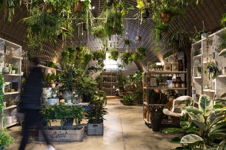
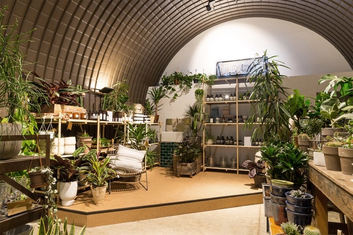
and then-studio have created one of the most unique spaces we’ve seen for Forest Store.
If a natural finish was what the designers were brief with, that’s definitely been delivered!
The outstanding element of this store is how ‘natural’ is integrated into every element of the store, from natural finish shelving structures to cork-lined counters, this delivers a consistent and unique experience.
See the full project https://retaildesignblog.net/2018/05/01/forest-store-by-and-then-studio-london-uk/ Photography by Adam Weatherley
Harvey Nichols
Now renowned for their use of interesting materials within their department stores, Studio Four IV have used the same approach for Harvey Nichols’ latest store in Qatar.
Their design shows that you can mix different finishes, with varying marble finishes contrasting against each other, each separated by a neutral colour scheme. We like the use of full length mirrors in the menswear section, which results in the appearance of more space within each section.
See the full project https://studiofouriv.com/harvey-nichols-doha
Yamamay
We’re unashamedly biased when it comes to this particular store design, as the seemingly modular slimline framework looks incredible. Yamamay’s mission in their stores is “to enter into the heart of every Yamamay woman by making the store an emotional and engaging environment.”
The resulting store environment is incredibly clean, with softly textured frameworks and finishes throughout. We particularly like the introduction of wooden storage within the existing metal structure, which helps add some practicality as well as a nice contrast in textures.
An all important aspect of this type of environment is lighting. Cool white light has been introduced throughout the store to help maintain the overall clean aesthetic, particularly important in the lingerie section.
See the full project https://unibox.co.uk/wp-content/uploads/yamamay-concept-piuarch-6.jpg Photography by Matteo Piazza
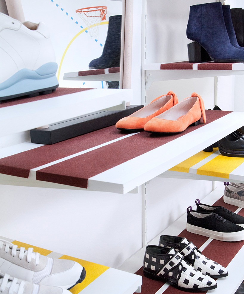
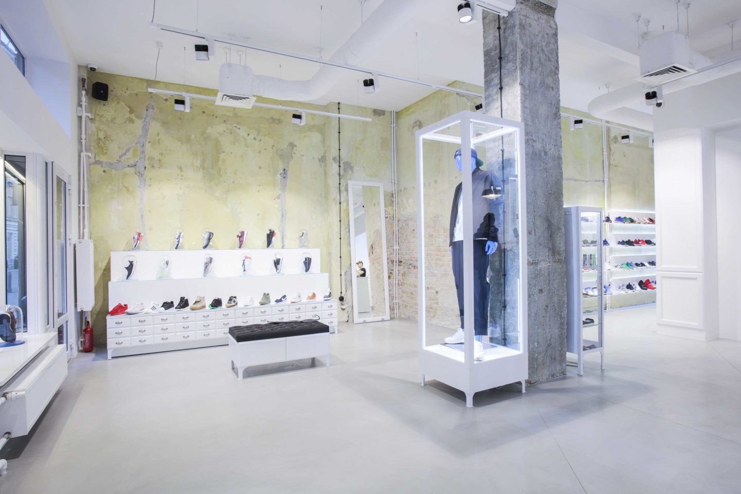
Sneaker District
Our favourite project this month comes from Barde + vanVoltt for the Sneaker District Store, who have taken a simplistic approach to their store design.
We love this project because it combines the versatility of a modular framework, with a custom designed approach.
By powder-coating the profile in a striking colour, mixed with the black backdrop and wooden shelves, each material stands out and creates a simple, yet incredibly effective display.
See the full project https://retaildesignblog.net/2018/05/04/sneaker-district-store-by-barde-vanvoltt-antwerp-belgium/ Photography by Thomas De Bryun
United Colours of Benetton

Italian fashion brand United Colours of Benetton unveiled their new London Oxford Street flagship store.
Designed by their in house team, the store utilises digital elements such as touchscreen tables and interactive screens to display the brands collections and current campaigns.
Wood, iron, stone and other natural materials furnish the space and work with the integrated lighting to create a bright ambient space.
See the full project https://www.designweek.co.uk/issues/19-25-march-2018/united-colours-benetton-opens-new-london-flagship-store/
Virgin Holidays Experiential Store
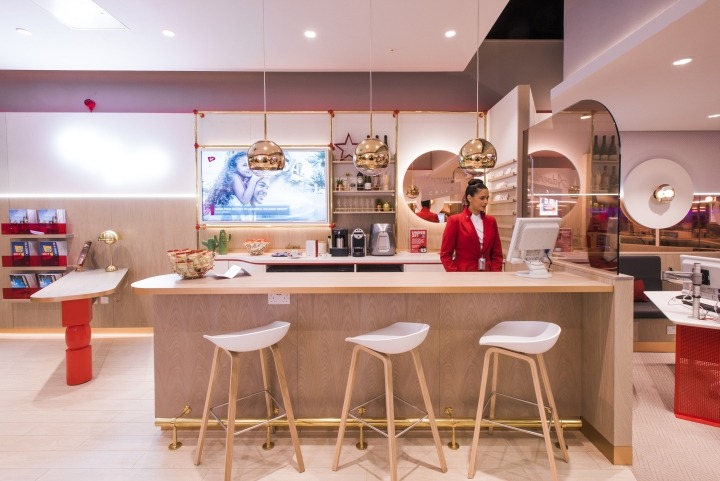
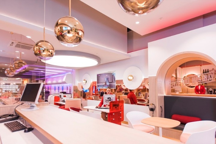
YourStudio teamed up with Virgin Holidays to design a multi-dimensional and immersive concept for their new v-room store in Cardiff, Wales.
Featuring a champagne and coffee bar, animated content and comfortable lounge areas, the store invites customers to ‘jump on board’ and immerse themselves in a range of signature destinations.
Rose gold and metallic colours are a feature throughout the store and a full-size mock-up of a Virgin Atlantic Cabin complete with Premium Economy and Upper Class seats allowing customers to try before they buy.
See the full project https://weareyourstudio.com/work/virgin-holidays/ https://retaildesignblog.net/2018/01/19/new-virgin-holidays-experiential-store-by-yourstudio-wales-uk/
Joe & The Juice
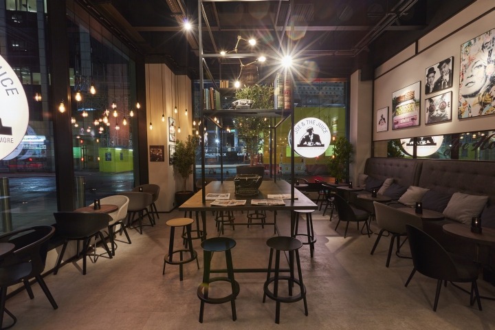
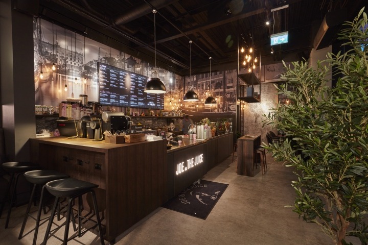
Danish Juice bar and coffee concept brand, Joe and Juice teamed up with CDS Group to fit out a range of their London branches.
Decorative finishes, flooring, furniture and other elements were all cleverly designed and fitted by CDS Group to create store spaces which encompass the brand’s unique and urban Manhattan style.
See the full project https://retaildesignblog.net/2018/02/16/joe-and-the-juice-by-cds-group-london-uk/
Luca Faloni – In the Hood pop-up store
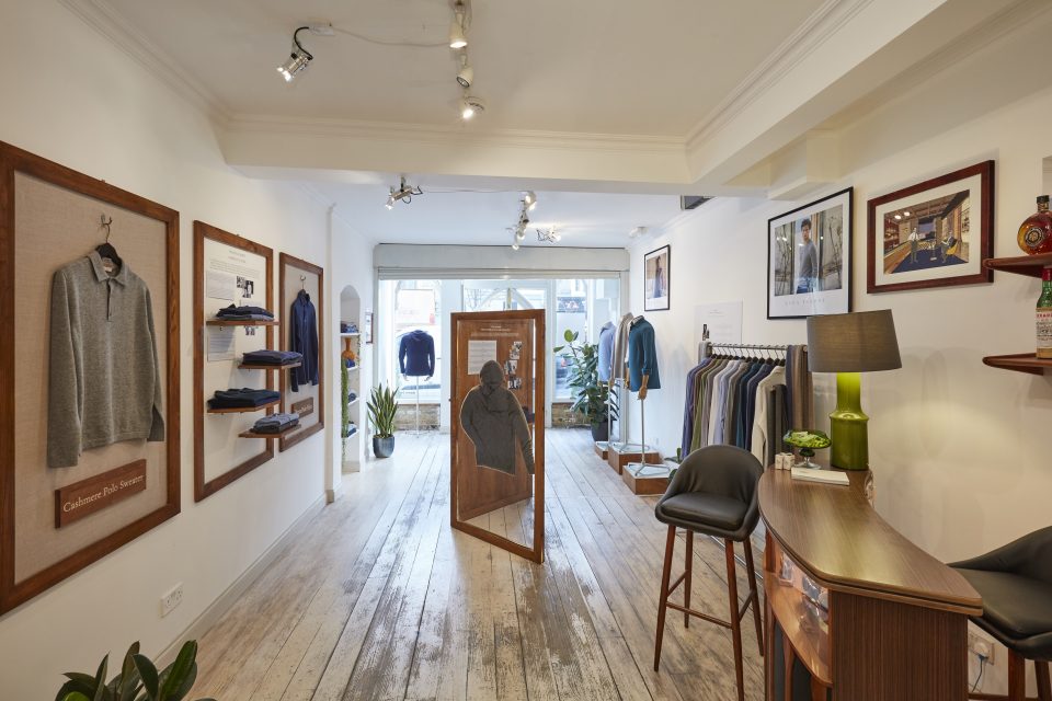
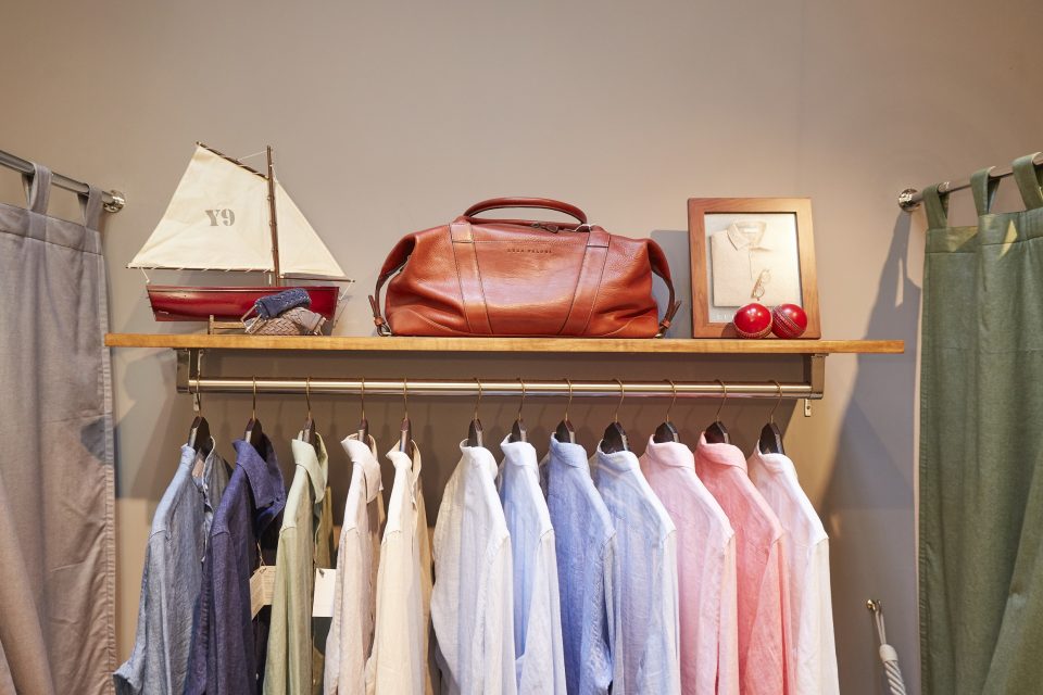
Luxury online menswear label Luca Faloni recently worked with London based visual merchandising company Lucky Fox to create a unique gallery and pop-up store space in Notting Hill, London.
The pop-up store was designed to work as a gallery space which explores the evolution of style for classic items such as hoodies, polo shirts and classic shirts which are all associated with the brand. The space also displays Luca Faloni’s current collection, giving customers the chance to try on pieces that are often only available to buy online.
Lucky Fox designed the store with the brands italian heritage in mind. A 1950’s style is created through the flooring, lighting, artwork and vintage furniture pieces.
See the full project https://luckyfox.uk.com/projects/luca-faloni/
Lululemon
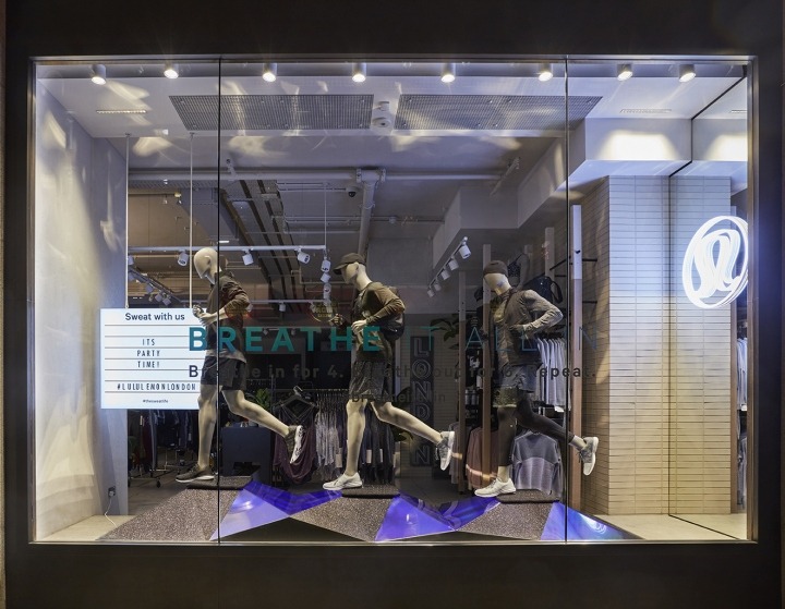
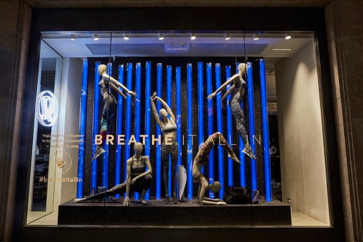
Designed by Lucky Fox, Lululemons new ‘Breathe it all in’ window display contradicted traditional festive window themes. The modern display was designed to remind passing shoppers to take a break from the chaos and take in the joy that the holiday season offers.
Reflective LED columns and calming gradient colours contrasted with the reflective black glitter floor and walls. Upon being touched, sensors on the glass trigger the LED columns to change colour and pattern, bringing an interactive element into Lululemons display.
See the full project https://www.luckyfox.uk.com/projects/lululemon-4/ https://retaildesignblog.net/2018/01/02/breathe-it-all-in-shopwindow-for-lululemon-by-lucky-fox-london-uk/
Birchbox
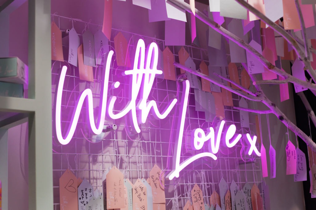
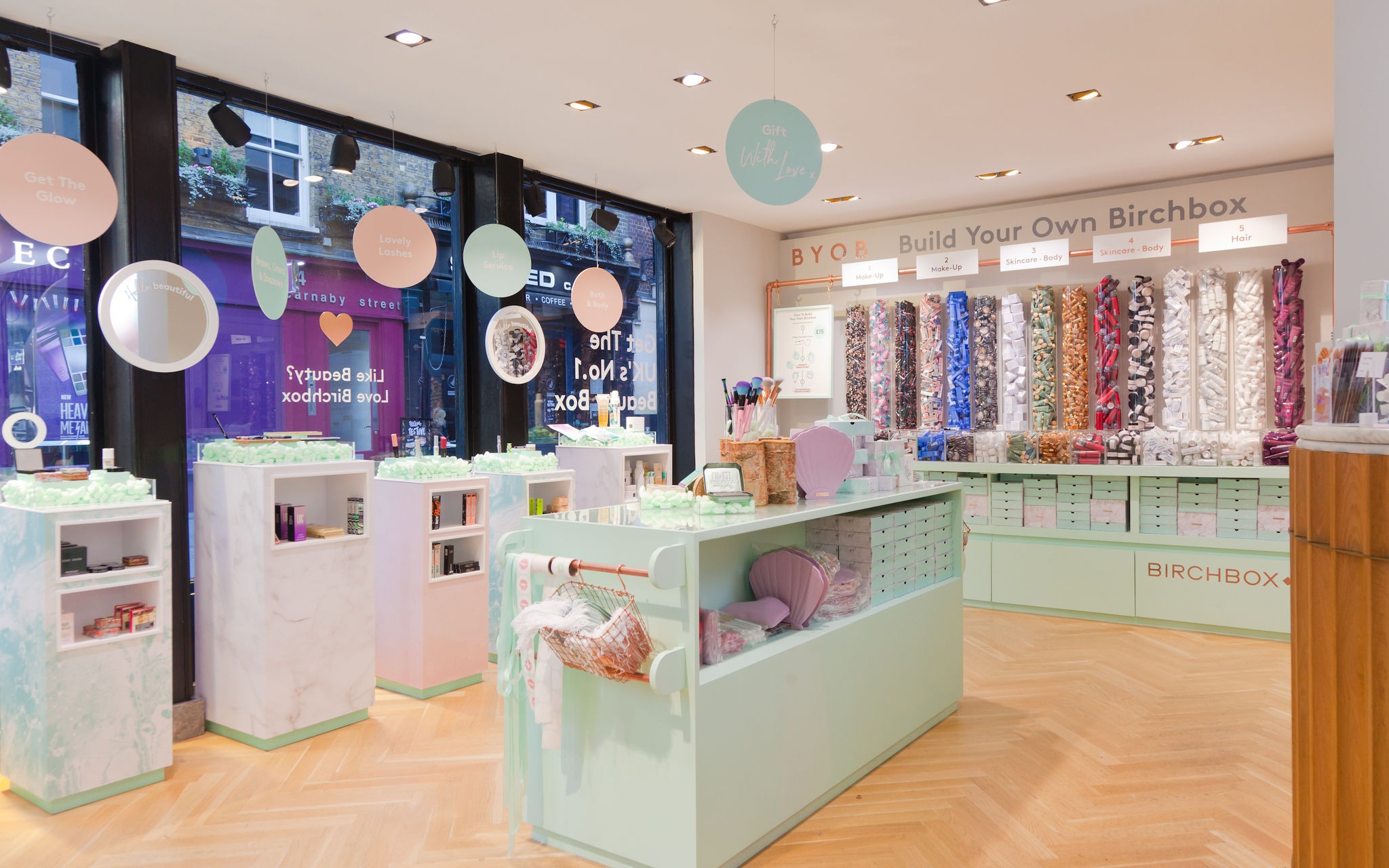
Leading beauty box and beauty e-commerce company Birchbox launched their first stand alone UK pop up store. Designed by YourStudio the store showcases Birchboxes ‘Build your own box’ pick & mix station and gift wrapping station.
Rose gold, marble and pastel colours create a warm inviting space for beauty lovers that encourages them to have fun discovering what the art of giving means to them.
A neon sign saying ‘With love x’ features within the wishing tree section of the space, where shoppers can add their wishes to the tree. We really like the inviting space that YourStudio have helped Birchbox create and love the neon ‘With love x’ sign. Find out more about our neon lighting here.
See the full project https://weareyourstudio.com/work/birchbox-london/ https://echochamber.com/article/birchbox-pop-up-london/
Carhartt W.I.P.
Carhartt WIP (Work in progress) a division of American brand Carhartt already has three stores in London, but recently added another branch located in London’s Pancras Square.
The new stores interior is designed by British designer Faye Toogood and features concrete flooring, canvas wall panels and a grid of metal pendant lamps. The choice of hardwearing materials use throughout the space create an industrial feel that delivers on the brands ‘rugged utilitarian’ store concept.
See the full project https://t-o-o-g-o-o-d.com/pages/carhartt-wip https://retaildesignblog.net/2017/12/14/carhartt-w-i-p-store-by-faye-toogood-london-uk/ Photography by French + Tye
Harvey Nichols
Harvey Nichols Christmas 2017 campaign focuses on spreading positivity with high energy displays. Using vivid colours and experimental lighting techniques has created a show stopping window display that puts a modern twist on the traditional idea of Christmas.
See the full project https://fashionunited.uk/news/retail/in-pictures-harvey-nichols-2017-christmas-windows/2017110626615
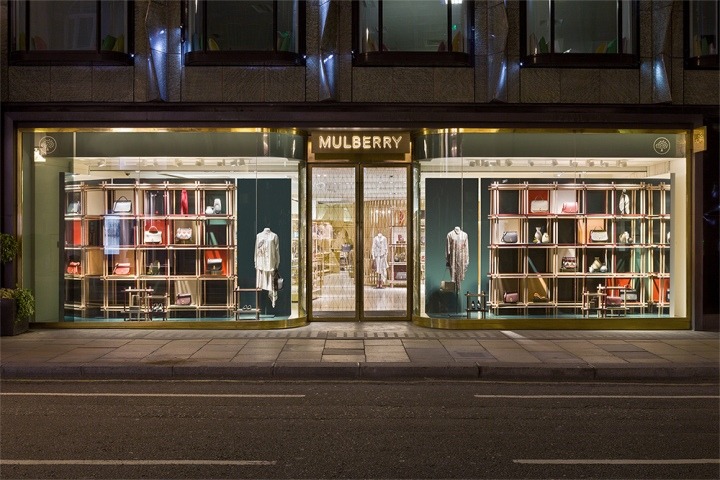
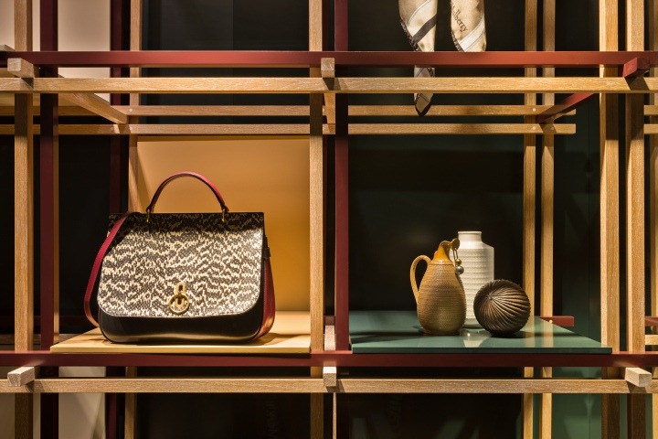
Mulberry
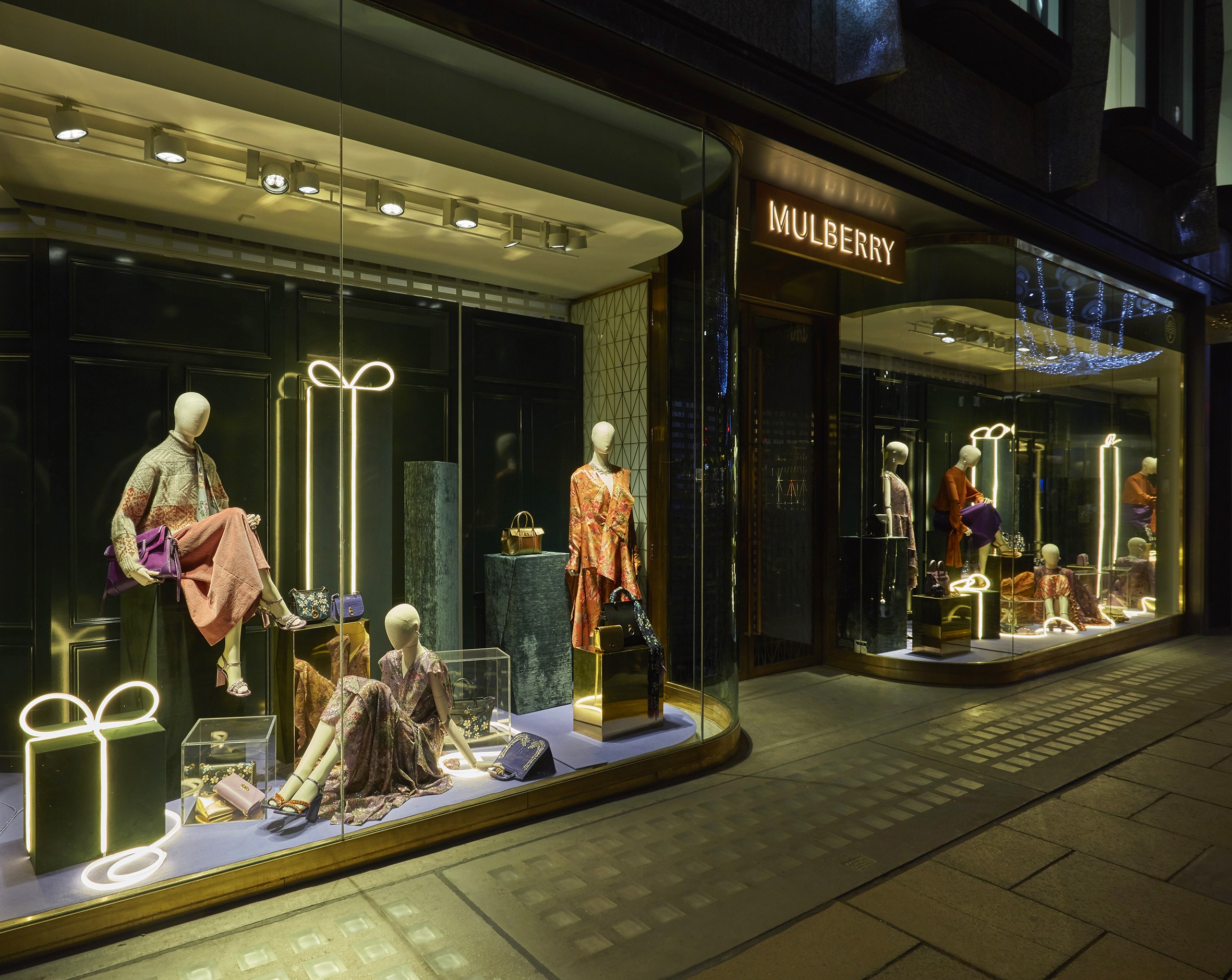
Mulberry’s Christmas window campaign was designed in collaboration with Blacks Visual and features hand crafted gift boxes in a range of brass, acrylic and crushed velvet finishes. Velvet plinths wrapped with neon tube lighting feature alongside the gift boxes to bring a festive glow to the simplistic display.
The use of neon lighting within the display emphasises the beauty of the luxury labels garments and accessories and gently illuminates the rich colours used throughout the window.
See the full project https://www.blacksvisual.com/mulberry-christmas-glow-windows-blacks-v/ Photography by Melvyn Vincent
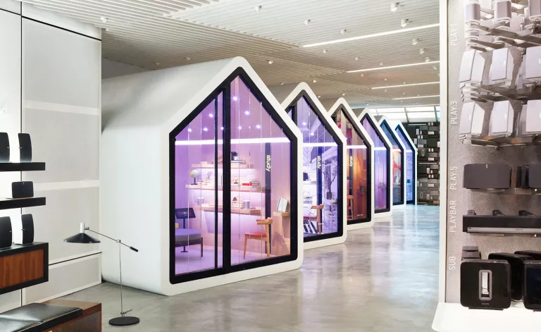
Sonos
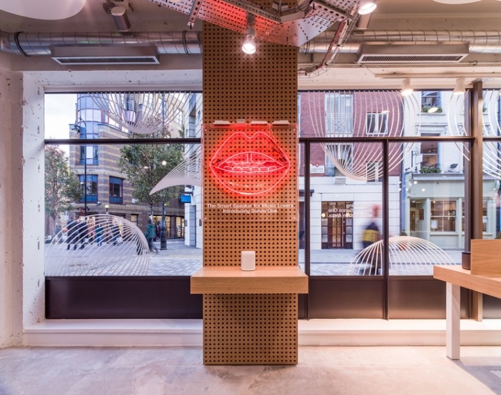
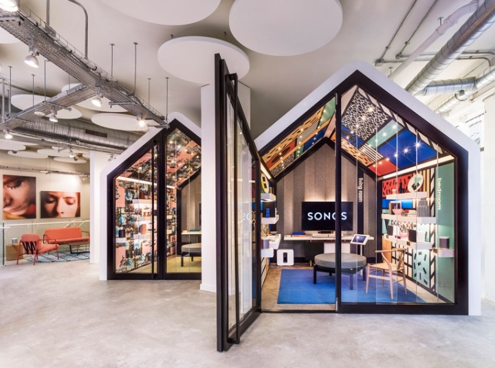
Sonos return with their homely, pod-styled retail environment in their first ever flagship store – Seven Dials, London. The standout feature being two house-shaped listening rooms, Sonos have aimed to emulate domestic listening experiences, helping communicate the benefits of a connected system in the home. In both of these listening areas, Sonos does a great job of creating an inviting environment whilst clearly displaying branded elements, allowing shoppers to relax whilst browsing the options available.
As an added element of visual merchandising, we love the way neon has been implemented against natural backdrops. Neon’s resurgence continues in retail, and it has been put to good effect here.
See the full project https://retaildesignblog.net/2017/11/16/sonos-store-london-uk/ Photography by Mel Yates
Marks & Spencer
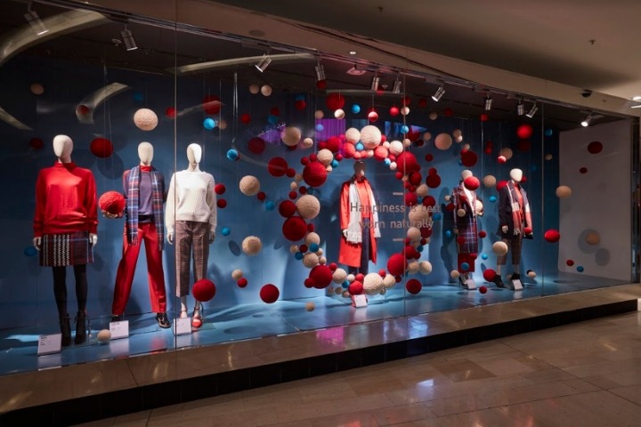

A simple concept, expertly executed. Marks & Spencer’s window display for Wool Week uses balls of wool against a high contrast coloured backdrop, adding depth and complementing the colours used.
Look closely at the placement of each visual merchandising element, Marks & Spencers have intelligently positioned clusters of wool, i.e. larger balls of wool towards the top of the display, to attract the eye towards a higher point on each mannequin.
See the full project https://retaildesignblog.net/2017/11/07/marks-spencer-wool-week-by-barthelmess-gmbh-uk/
Hunter
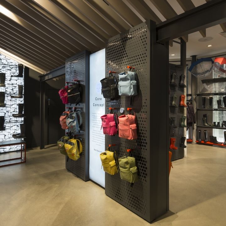
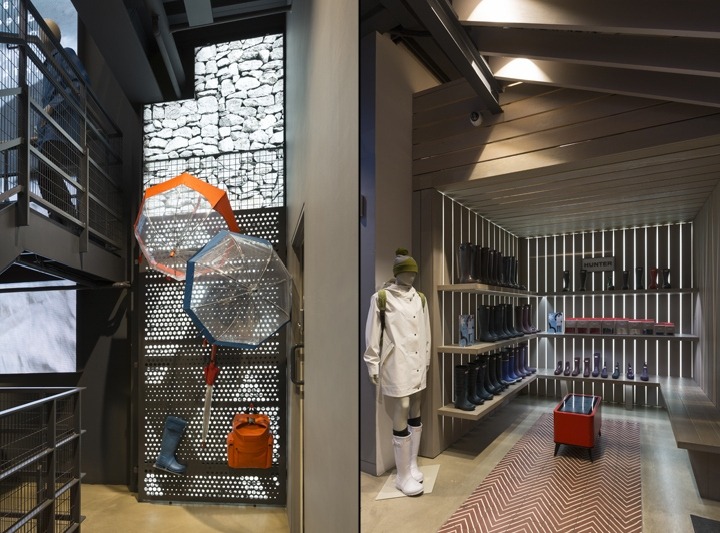
Hunter have implemented a wide array of textures in their latest store, creating an ideal environment for their target audience. Now becoming an iconic feature of Hunter stores, the stone-finished graphic which is applied to a floor-to-ceiling LED Lightbox is a brilliant feature and one that demonstrates the ability of light boxes to not only illuminate graphics, but also architectural finishes.
We also love the linear lighting applied to shelving, as this subliminally creates product sections without a physical barrier between each product.
See the full project https://retaildesignblog.net/2017/11/10/hunter-by-umdasch-shopfitting-london-uk/
Nike – Mynt
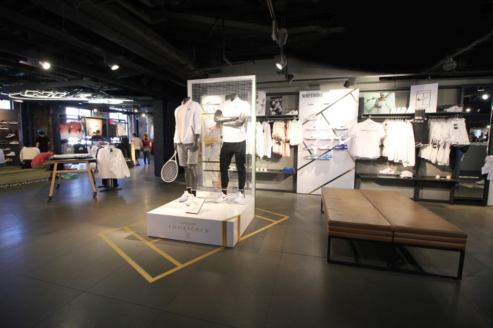
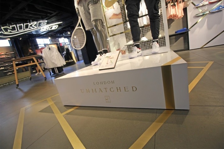
Mynt were approached by Nike to create a retail campaign for Wimbledon. The concept, London Unmatched, incorporated materials and finishes that feature at Wimbledon.
The retail concept featured gold floor vinyls, mesh backdrops and green turf all reminiscent of the trophies, tennis rackets and courts at Wimbledon. Mynt launched the Wimbledon retail concept across many Nike stores in London to provide shoppers with an authentic Wimbledon retail experience.
See the full project https://retaildesignblog.net/2017/10/02/nike-court-london-unmatched-by-mynt-london-uk/
Tommy Hilfiger
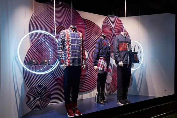
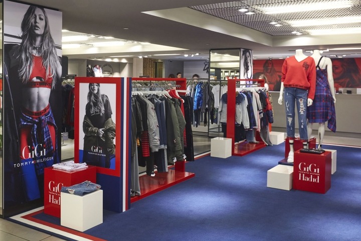
During London Fashion Week, StudioXAG produced and installed store take-overs of Selfridges London for the launch of Tommy Hilfiger & Gigi Hadid’s new collection.
In-store at Selfridges, spaces were created for menswear and womenswear. The spaces were corresponding and focused on the use of Hilfiger’s signature red and blue colours. The window display at Selfridges was based around a circular theme, neon rings illuminated the products on display and the circular patterns used alongside the neon created an optical illusion for passers by.
See the full project https://retaildesignblog.net/2017/10/18/tommy-hilfiger-x-gigi-hadid-fashion-displays-at-london-fashion-week-by-studioxag-london-uk/
Canada Goose – David A. Levy & Associates
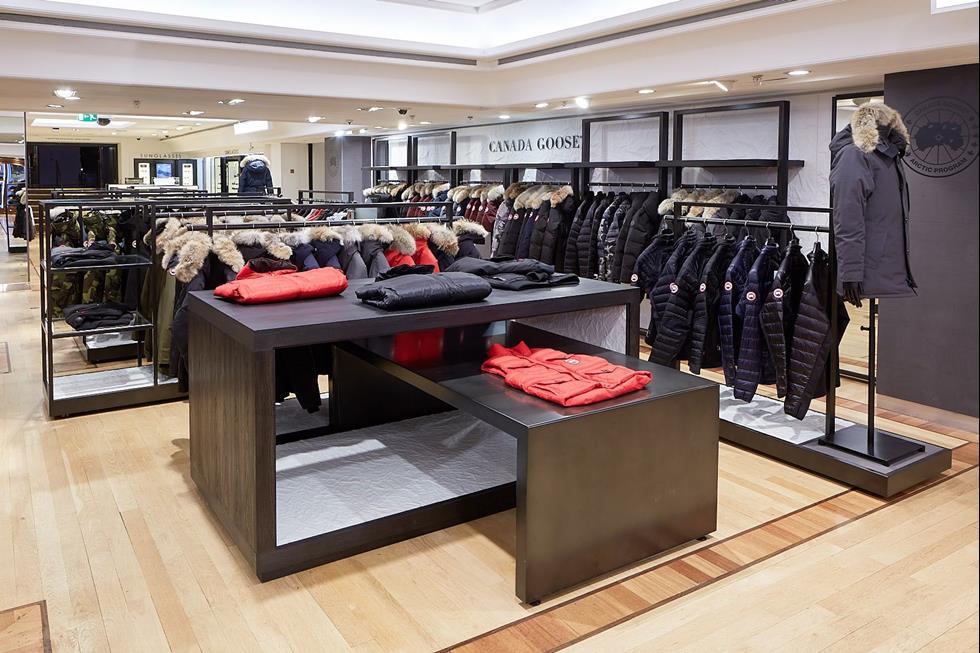
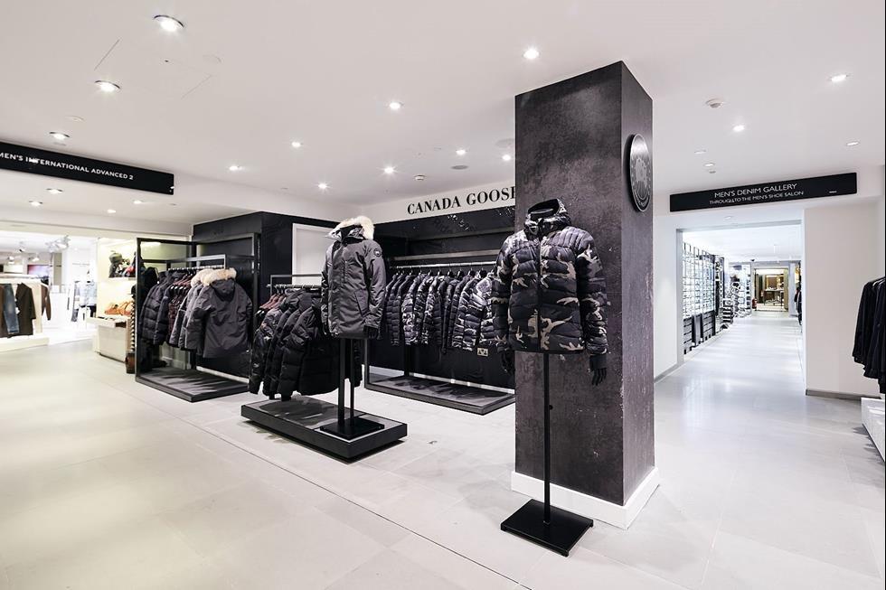
This month, Harrods received two new Canada Goose store fitouts. A large womenswear and menswear shop and a smaller pop up shop which showcases the brands Black Label Collection.
The spaces were designed by David A. Lewy & Associates and installed by Double Retail. The two spaces feature textured concrete panels, wood finishes, industrial polished steel and Canadian marble which highlight the brands detailing and quality.
See the full project https://www.retail-week.com/fashion/first-look-canada-goose-revamps-harrods-shop-in-shop/7026186.article
Reserved
Reserved, the Eastern European equivalent of H&M have opened the doors on their first UK store on Oxford Road. Operating from a 32,000 square foot space, Reserved’s space is a culmination of many current trends within retail design.
Slim black frameworks display their ranges of merchandise throughout the store, with standalone units with branded infill panels creating separate mini-experiences.
Reserved have also taken a leaf out of Missguided’s book, incorporating video technology throughout the store to increase engagement alongside the opportunity of updating displays to suit particular promotions, seasons and trends quickly.
See the full project https://www.drapersonline.com/news/first-look-inside-reserveds-debut-uk-store
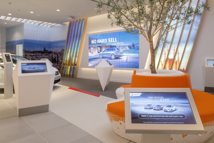
Volkswagen, Dalziel & Pow
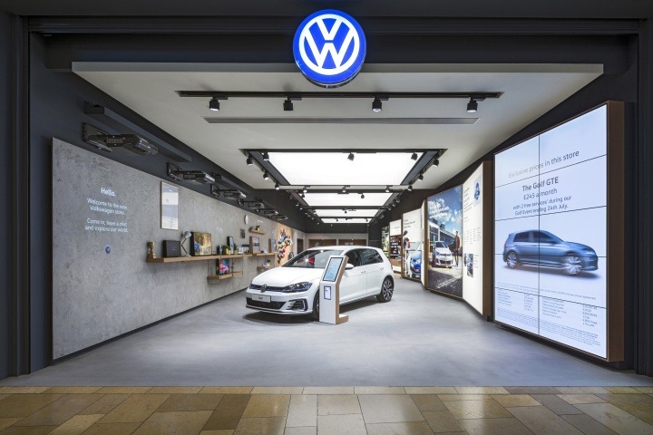
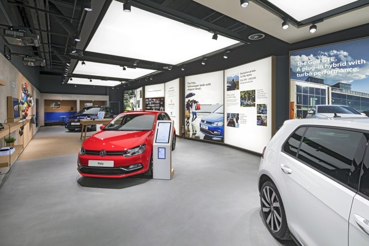
Dalziel and Pow have created a brilliant space for Volkswagen, for its first store concept in the Bullring, Birmingham. Following Green Room Retail’s launch for SEAT, Dalziel & Pow have used a similar method of illuminating the focal point of the store – the cars themselves – by placing ceiling-hung light boxes directly above. The displays themselves catch the eye, however coupled with the shine from the cars underneath, create a minimal, cinematic feel.
We also love how Dalziel & Pow have placed the illuminated graphic displays in store, angling each pair of graphics towards the car they focus on. Whilst simple, this adds depth throughout the entire store and creates clear segmentation.
See the full project https://www.dalziel-pow.com/work/volkswagen https://retaildesignblog.net/2017/08/28/volkswagen-showroom-by-dalziel-pow-bullring-uk/
Champion, d+d group
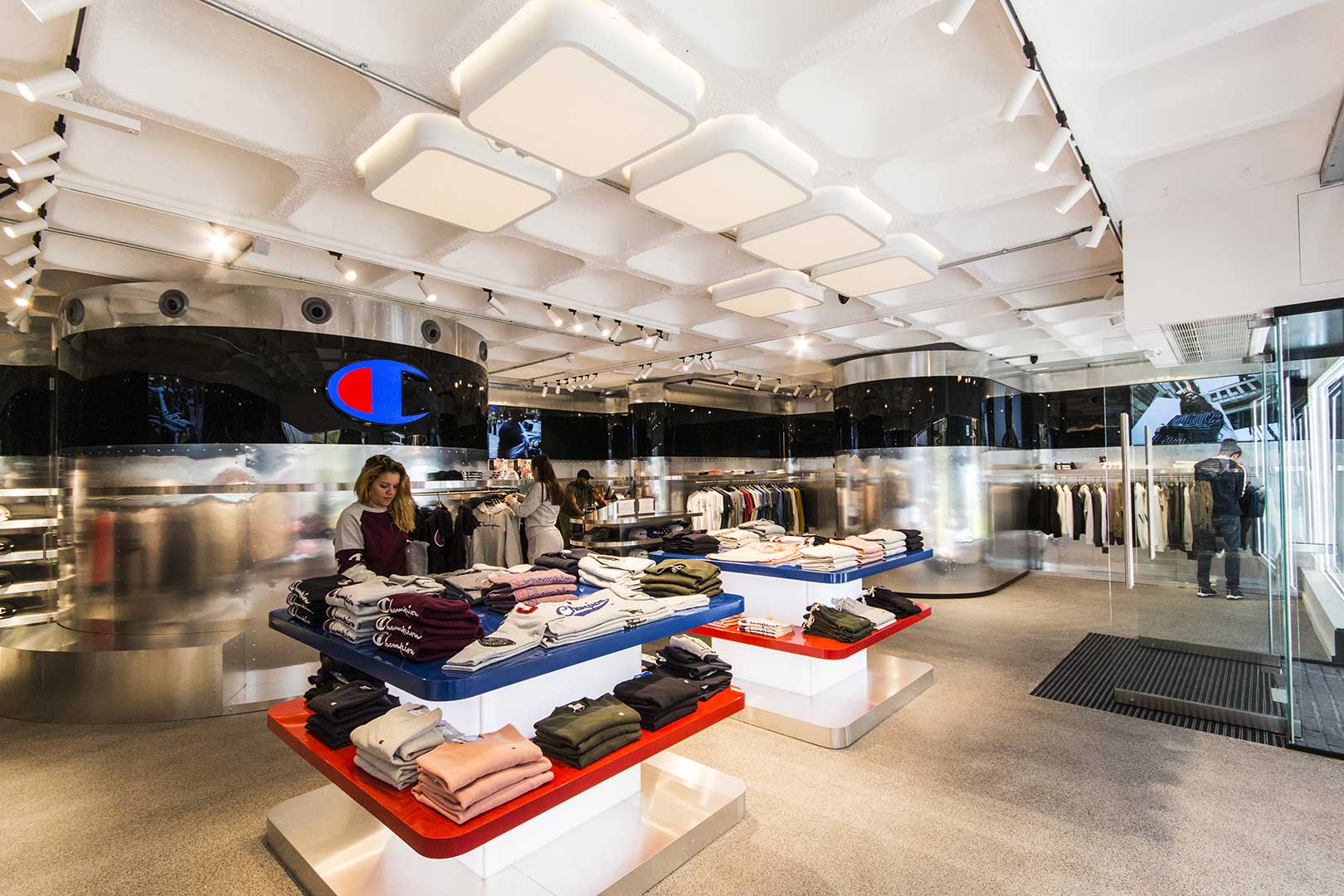
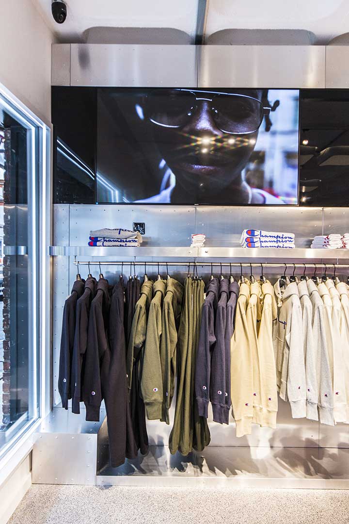
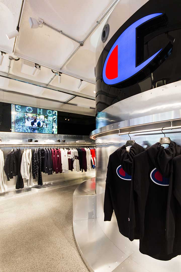
Champion have opened their flagship store in Soho, created by d+d group, who have done a great job of conveying the sportswear roots of the brand.
In contrast with other heavily merchandised sportswear stores, Champion present shoppers with a minimalistic entrance, featuring low-level gondola displays that create an open feel to the space.
A brilliant design feature is the sheet metal cladding throughout the store, complete with punch marks along the edge of each panel. Although subtle, it creates a ‘locker room’, industrial vibe that is perfectly in sync with the brand.
See the full project https://www.dplusd-group.it/work/champion-premium-london/
Topshop – Blacks VM
Topshop’s latest window display, created in collaboration with Blacks VM, is eye-catching to say the least. Using a whole host of various coloured neon signage to provide a backdrop to the window display, the summer theme is completed with integrated plinth lighting which directs attention towards the mannequins.
We particularly admire the cleverness of Blacks VM’s display, which is achieved by arranging the neon lighting in a way that draws attention to the window, yet because of the thin-gauge nature of neon provides visibility through to the rest of the store, providing an inviting feel to the display.
You can learn more about how to implement neon lighting in retail here.
See the full project https://retaildesignblog.net/2017/08/11/topshop-oxford-street-neon-summer-window-london-uk/ Photography by Melvyn Vincent
Mulberry
Continuing our focus on VM and window displays, Mulberry have created a brilliant window display, which is heavily inspired by the ‘strong checks used in the AW17 Ready-to-wear collection’. Although not immediately obvious, the grid structure has been created using thin wooden (or wooden effect) sections, with different grains and colours giving the display depth.
We love the focus that each product is given throughout the display, by doubling up on the framework between each individual section. Retail design in general has been moving more towards thin-gauge structures and minimal frameworks, however this window display highlights how effective a layered approach can be.
We have developed our modular display structure around VM systems, and recently launched new powder-coating options including the effects shown here: from wooden finishes to plated metals. Find out more here.
See the full project https://retaildesignblog.net/2017/08/12/mulberry-new-bond-street-aw17-check-window-by-mulberrys-creative-vm-team-london-uk/ Photography by Michael Franke
Thomas Cook – Wanda Creative
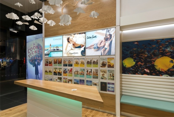
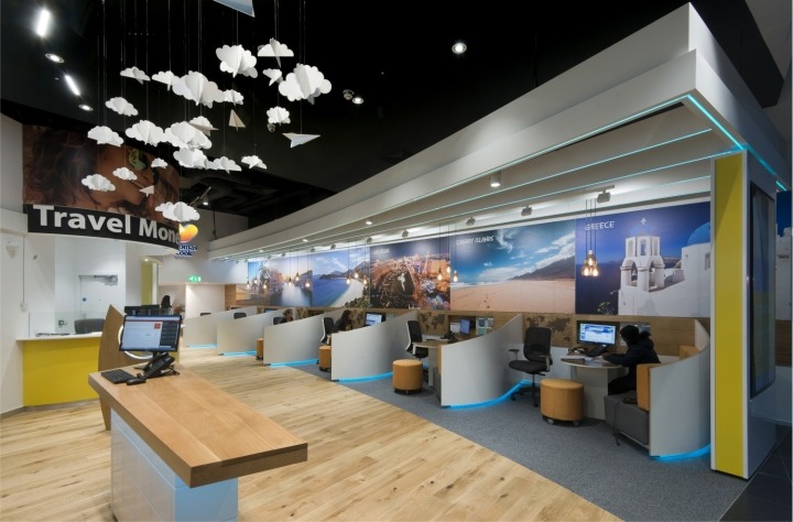
Wanda Creative have introduced a new phase in the development of Thomas Cook’s brand, with a new concept launched in Westfield Stratford. While the store aesthetic is unmistakably Thomas Cook, we specifically like the details present through the store that add to the customer experience.
Our favourite is the paper-style clouds and paper planes hanging from the ceiling around brochures and illuminated graphic displays. Another subtle addition that adds to creating a vibrant in-store experience is the introduction of accent lighting around booths and structural elements of the store. This helps reinforce the brand aesthetic of Thomas Cook, but also ensures what are traditionally poorly lit areas, incorporate lighting.
Integrated lighting is a crucial aspect of modern day retail design, learn more about our approach to retail display here.
See the full project https://retaildesignblog.net/2017/07/27/thomas-cook-westfield-stratford-store-by-wanda-london-uk/ Photography by Robert Greshoff
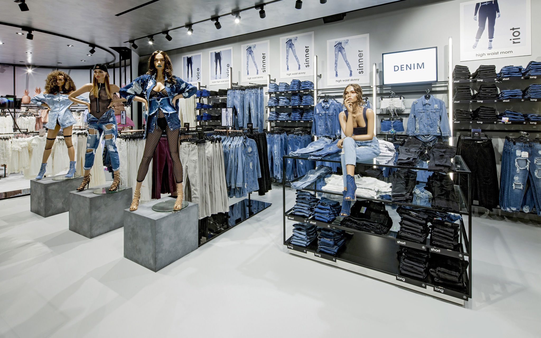
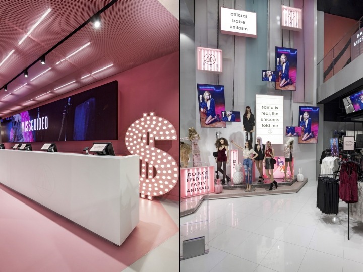
Missguided – Dalziel & Pow
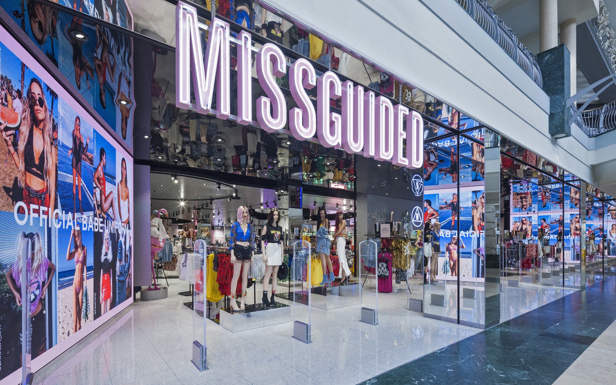
Our personal highlight this month comes from our friends at Dalziel & Pow, with the launch of their latest Misguided store in Bluewater, Kent. In Missguided’s own words: ‘Missguided in real life is much more than just a shop; it’s a next level shopping experience.’, and the design team at Dalziel & Pow have certainly lived up to this ethos.
There are standout features across the store, but to reign our excitement in slightly – we’ll focus on two. Using a clever bit of positioning, the large LED AV Units that flank each side of the store entrance create an inviting display that draws visitors into the store, especially when you consider these graphics aren’t static – they’re constantly updating thanks to the clever technology implemented by Smart LED, running from a centrally managed content system. This puts Missguided in the ideal position of being able to adapt their store signage quickly, responding to trends their consumer will resonate with.
A slightly more traditional display that we love comes in the form of Missguided’s denim section. The simple graphics mounted to the back of the area, combined with the high brightness ‘DENIM’ light panel, attracts customers whilst the displays & mannequins are designed to provide the inspiration Missguided’s audience looks for. Clear segmentation of products on the slimline product display framework, along with neon-style lighting running parallel to the back wall display make it easy for shoppers to find what they’re looking for.
See the full project https://echochamber.com/article/missguided-bluewater-kent/
Cross / Sheaffer
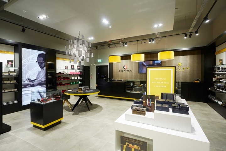
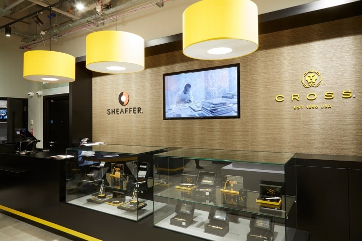
Having previously worked with Pinnacle Creative on exhibition displays for Cross / Sheaffer, we were excited to see a new concept store opening this month. Remaining true to the brand aesthetic that’s instantly recognisable, the concept succeeds in creating a high-quality environment whilst being softened by the use of authentic and natural materials – such as the light, unfinished concrete flooring and wood grain effect on the back wall.
We particularly like the freestanding product display units, that serve two purposes and branding elements and a platform for product display. The sleek nature of these displays, with UV bonded glass tops and seamless graphic wraps, contribute to a highly visible product offering.
See the full project https://retaildesignblog.net/2017/06/26/cross-sheaffer-pen-store-by-david-adcock-and-sean-revell-swindon-uk/ Photography by Gordon Singer
SEAT & Green Room Retail
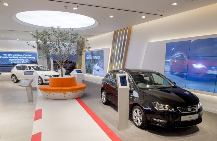
The Automotive industry continues its movement into retail spaces with SEAT’s new space within intu Lakeside. Designed by Green Room Design, this concept does a brilliant job of bringing the outside indoors with a range of retail display techniques. With digital screens tactically placed in close proximity to each car, this gives a fast-paced feel to the environment whilst the natural elements of the store – taking a leaf out of Foster & Partner’s reincarnation of the Apple store – complement the outdoor feel.
See the full project https://retaildesignblog.net/2017/01/19/seat-uk-showroom-by-green-room-retail-birmingham-uk/
Mamas & Papas

Dalziel & Pow have created a beautifully-clean store concept for Mamas and Papas in their new Glasgow Fort store. We immediately noticed the use of neon-style signage, which provides a streamlined wayfinding solution without the bulkiness of full graphic displays. By using an LED alternative to neon signage, D&P have more control over the final colour temperature of the signage, meaning they could match the coolness/warmth of the white light to the store environment lighting. We also love the stars and moon created in the same way – an incredibly nice touch.
Where necessary, the store also features more traditional ceiling-hung lightbox signage, which has been implemented in a subtle way. By using lightweight fonts and a simple white illuminated fabric – again with custom colour temperatures to ensure the light matches the store, the display matches the POS signage style and doesn’t add any bulkiness to the store atmosphere.
See the full project https://retaildesignblog.net/2017/05/27/mamas-papas-store-by-dalziel-pow-glasgow-uk/
V&A Museum Shop
Friend and Company have designed the V&A Museum Shop, creating zoned areas that guide visitors to specifically merchandised areas. The two zones are effectively illuminated using the high level surrounds above each display, which clearly distinguishes the areas from the rest of the shop whilst still providing an open, airy feel. By suspending the illuminated panels above the areas, Friend and Company have allowed space below for modular-looking visual merchandising, with room for free space between each section that opens up the area.
Along the side wall, which spans the entire length of the store is again, modular-looking, shelving systems. We particularly like the isolated use of shelf illumination, with warm-coloured LED lighting highlighting featured products. This is only done where the colour of the shelf itself is black, which blends into the back wall, introducing a single line of light.
See the full project https://friendandcompany.co.uk/V-A-MAIN-SHOP https://www.e-architect.com/london/victoria-and-albert-museum-shop Photography by Ed Reeve
The White Tower Gift Shop
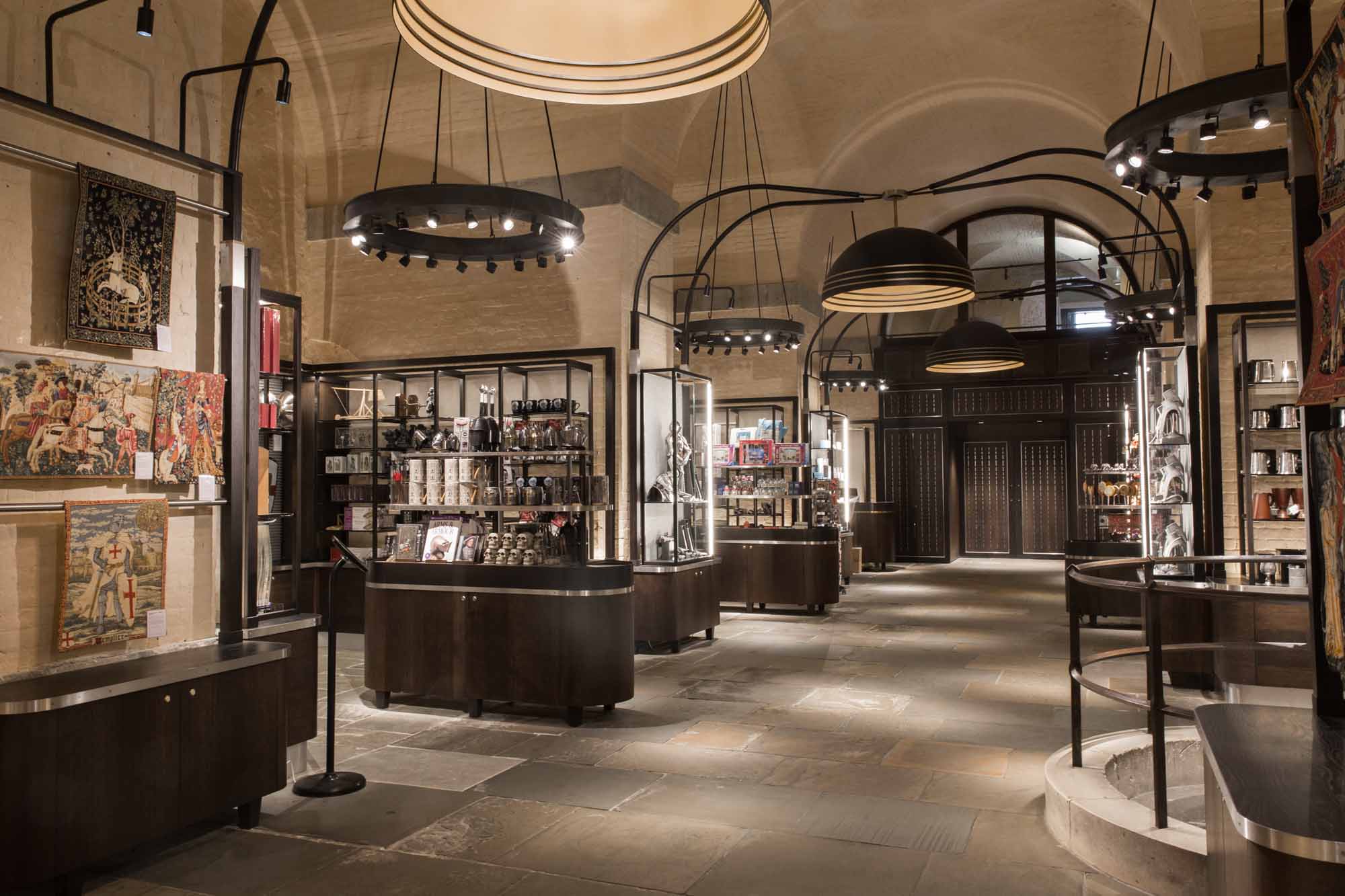
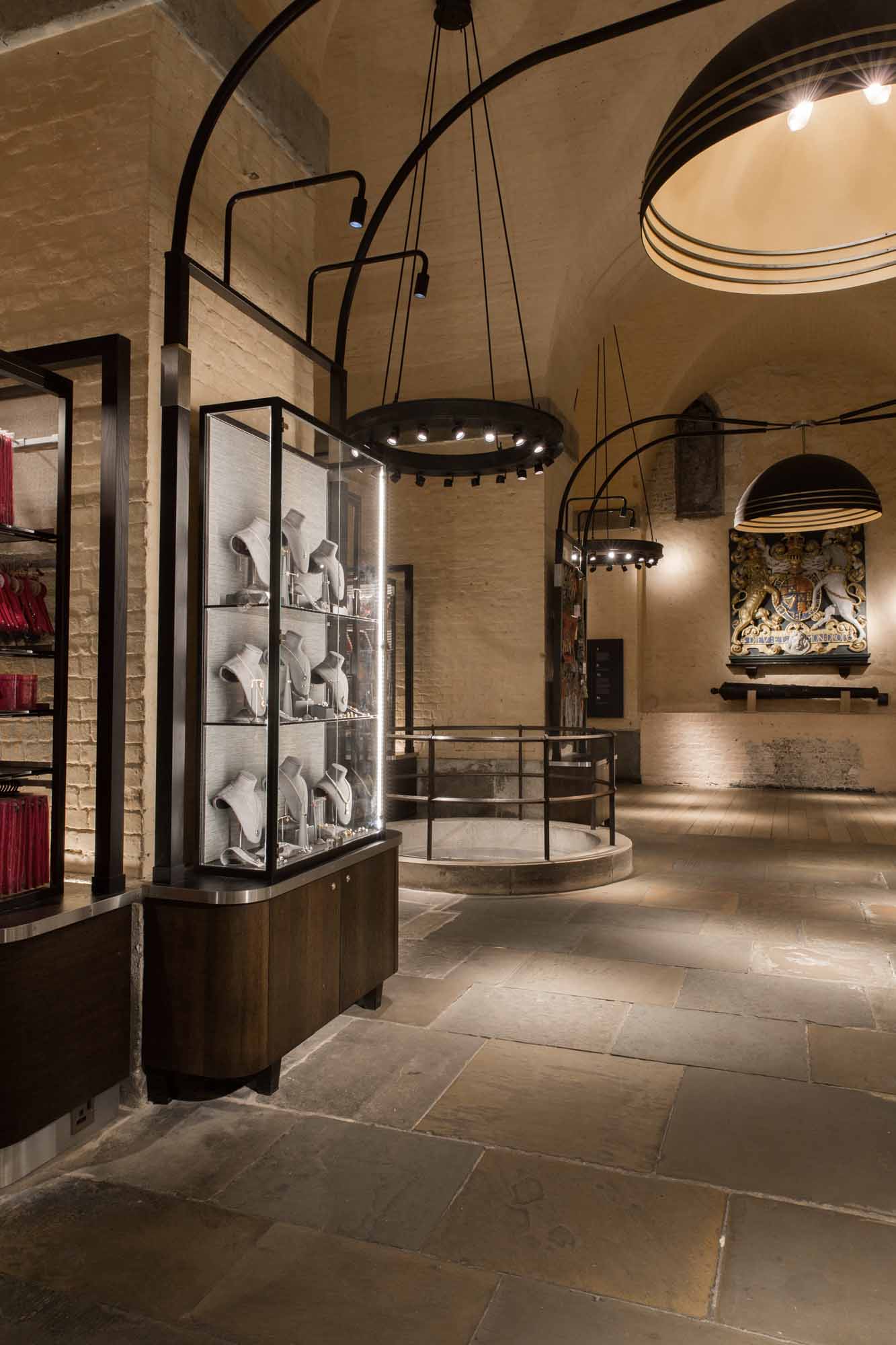
The White Tower Gift Shop represents an interesting use of showcases & retail design. The store needed to provide an authentic experience for visitors who will have passed through the masses of armoury and weaponry via several floors in the tower, and the use of finishes and lighting have definitely achieved that.
The showcases focus customers attention as they visit the store, due to their naturally increased presence through LED illumination. However Kinnersley Kent Design have implemented the use of finishes to the framework itself, the back panel, and storage below incredibly well, with dark tones that soften the vibrant nature of the display and bring the showcases back in line with the rest of the shop.
See the full project https://www.archilovers.com/projects/207509/the-white-tower-gift-shop.html
CAMPER
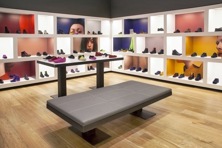
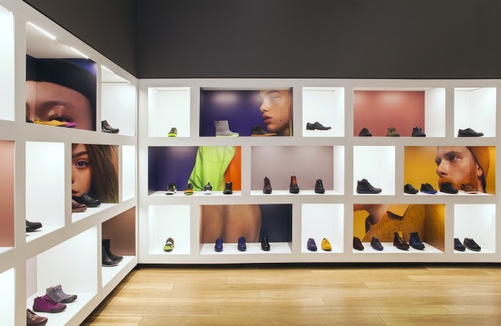
We love Camper’s approach to product display. By using a solid white outer unit, the products and colours within it are framed perfectly, providing the option of enclosing product specific lighting and displays.
The integrated lighting, in particular, has been implemented to brilliant effect, with recessed lighting giving an invisible finish to the illumination, putting full focus on the products. We’ve recently developed a similar shelving system, with added modularity, Kontakt.
This provides an ideal contrast to the colours panels, that give added depth once you notice that the images wrap around the inside of the shelving display itself, revealing more as visitors explore the store.
See the full project https://retaildesignblog.net/2017/04/30/camper-wtc-store-by-montroy-andersen-demarco-camper-new-york-city/
PRADA
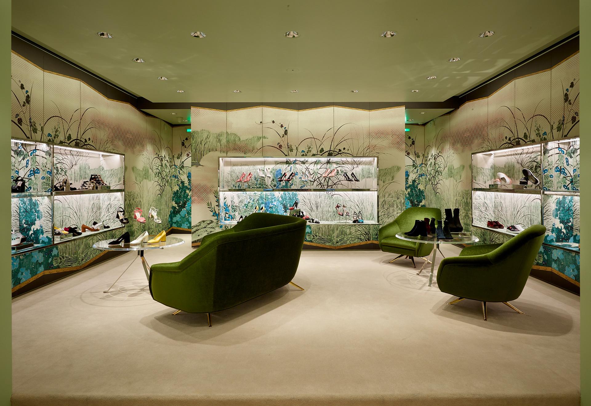
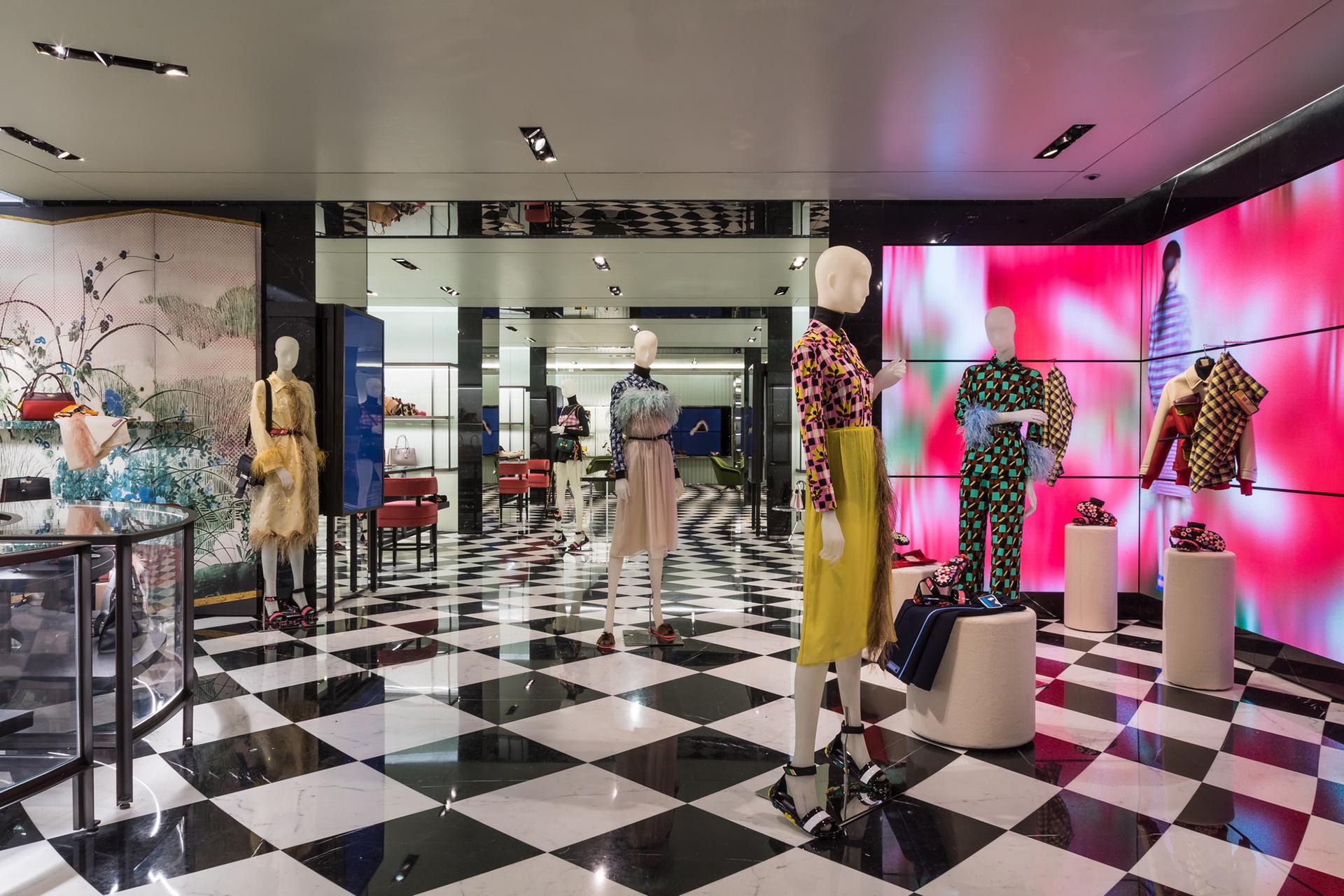
Prada are another retailer that have taken an interesting approach to shelving design. Whilst the products on display don’t immediately scream out at the shopper, the store is much more of a destination and therefore required to provide an experience, rather than a quick sale. The integrated illumination again helps to differentiate product display areas from the graphics on the wall.
Whilst the store is expansive and has been based on the concept of traditional folding screens, Prada has installed animated screens throughout. Particularly when used in large spaces, the screens provide an added moment of theatre, ultimately with the aim of improving the experience for shoppers. We recently posted a blog that looked into the effectiveness of digital signage – you can find it here.
See the full project https://www.frameweb.com/article/pradas-response-to-todays-fast-changing-fashion-is-surprisingly-ancient
HERMES
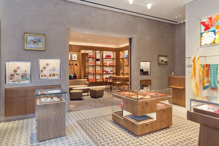
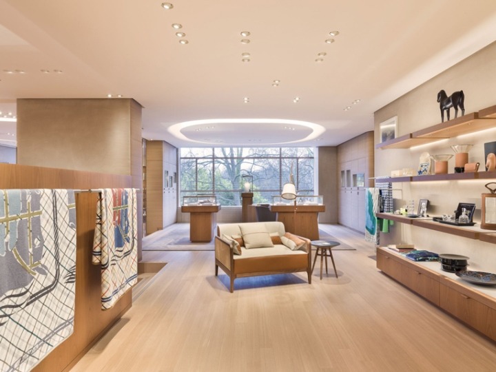
Hermes have created a more serene environment, when compared directly to Prada’s retail environment. By using authentic materials in their design, such as light grain woods and seemingly unfinished concrete, they create a space that is welcoming.
In particular we like how Hermes have implemented lighting throughout the store, with different applications depending on the theme for each room. In the open plan room above, a warm lighting style has been implemented, which removes the harsh light that colder temperatures can sometimes provide.
See the full project https://www.rdai.fr/en/projects/266/hermes-cadogan-london/hermes https://retaildesignblog.net/2017/03/29/hermes-store-relocation-by-rdai-london-uk/
Apple
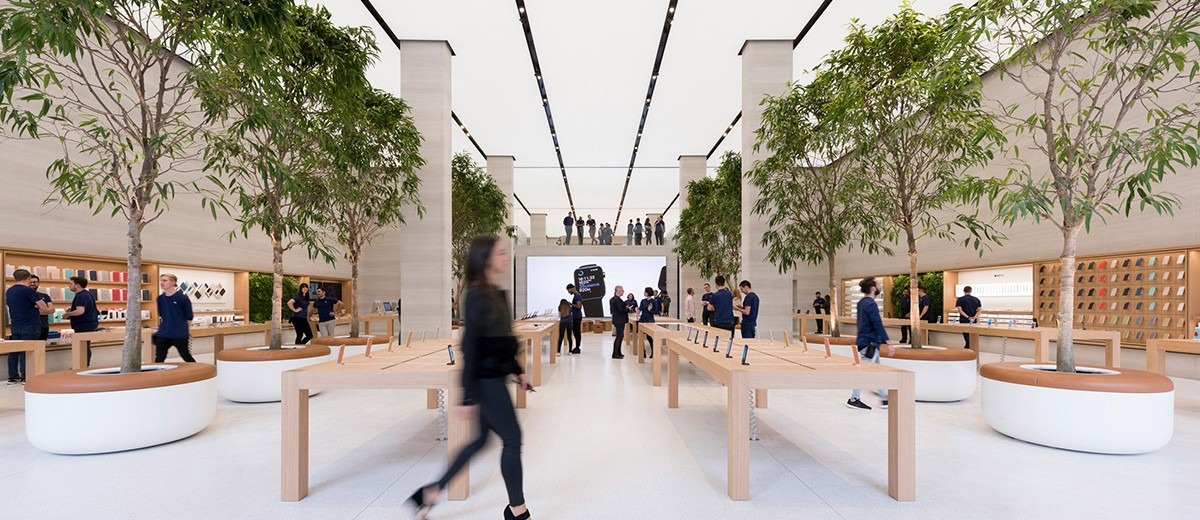
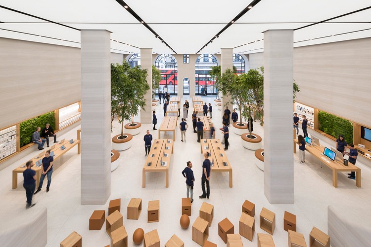
This wouldn’t be a retail design blog without featuring Apple. Apple’s expansion of their new retail format, developed by Foster & Partner’s, has been installed in the Regent Street store – which was Apple’s first store in Europe. They have treated the store with equal significance this time around, with the open, community-based design providing an amazing retail experience, from both a design perspective & customer perspective.
The most notable addition to the San Francisco-born concept is the added textures. The easiest one to spot is the mid-display seating areas, backed with artificial foliage. However, when you look deeper, the traditional metal feel cladding throughout the store has been replaced with an incredible light grain wood texture, which adorns huge spans of wall space and central pillars.
To complement the new design, almost the entire ceiling consists of mounted light panels, which with the necessary, yet opportunistically, located strips between each panel, add to the perception of depth to the store, inviting customers to explore further.
See the full project http://www.fosterandpartners.com/projects/apple-regent-street-london/ https://www.urdesignmag.com/architecture/2016/10/14/foster-partners-apple-regent-street-store/ Photography by Nigel Young
Wrangler
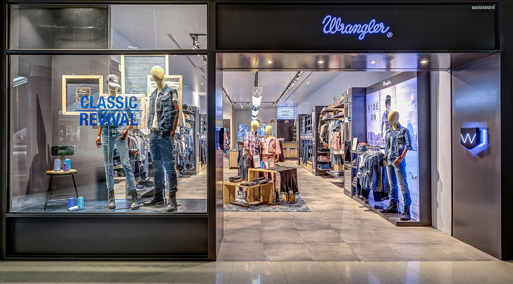

Wrangler’s new store in Bangkok uses illumination perfectly, but each instance has been specifically designed to incorporate their branding to create focal points throughout the store.
Taking a staple lighting element, overhead illumination, Wrangler have created a custom casing that not only fits in with their brand aesthetic & incorporates their logo, the angle of the casing projects light towards the outer edges of the store, where their products are on display.
We particularly like how Wrangler have created an integrated product & graphic display, that greets customers as they enter the store. The light alone is enough to catch the eye, but with clever placement of featured products, it creates an impactful, sales-driven area.
See the full project https://uxus.com/project/the-wrangler-roadhouse https://www.dexigner.com/news/29230
Denham
Denham have updated their Amsterdam flagship, with a brilliant use of limited space. The ground level features a full-size retail space, but as you progress through the store, the stairwells provide momentary glimpses into the latest styles, and feature different products.
Denham’s approach to this store is striking, and completely true to their brand. From the blue pillars that have been purposely installed to keep a constant theme throughout the customer journey, to the ‘makeshift’ flooring consisting of different grains, finishes & textures of wood, Denham have created a memorable flagship experience.
See the full project https://retaildesignblog.net/2016/10/18/denham-flagship-store-renewal-amsterdam-the-netherlands/
adidas Originals
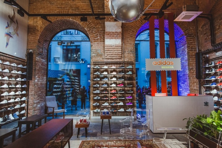
adidas Originals have launched their sole flagship in Russia, situated in Moscow. The brand have recently been pushing a changed aesthetic, with collaborations with the likes of Stormzy & Paul Pogba representing a new method of brand alignment, something which has impacted their in-store design.
Authentic materials are used throughout, with original exposed brickwork adorning the centre of the stores footwear displays and concrete flooring effects. However these are mixed with high impact, contemporary display solutions to lift the appeal of the store, such as the neon signage above the changing rooms, and the barely noticeable acrylic furniture cleverly placed next to vintage styled pieces.
See the full project https://retaildesignblog.net/2016/10/05/adidas-originals-flagship-store-by-stereotactic-moscow-russia/ Photography by Julia Mayorova
Stomping Ground
Stomping Ground’s new store is an incredibly clean environment, that does a brilliant job of inviting customers to take a closer look at products. This is a result of the clutter free flooring space, combined with the illuminated product zones.
Using flat sheets of illumination (we presume using LED light sheets, with an acrylic diffuser), the products take full focus. This same principle is applied to the footwear display, with has a solid concrete backdrop and tightrope style wires housing the shoes.
See the full project https://retaildesignblog.net/2016/10/03/stomping-ground-store-ottawa-canada/
Butterfly Milkbar – Thaipanstudio
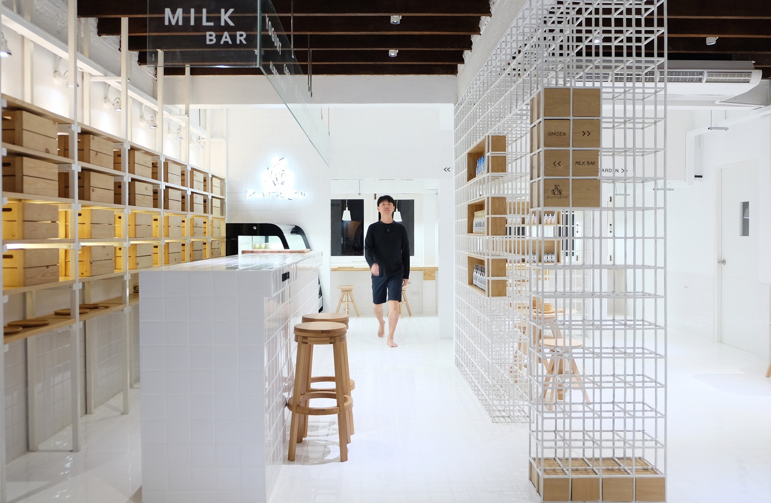
The Butterfly Milkbar by Thaipanstudio uses a slimline modular system for a range of purposes. You immediately notice the small-frame nature of the display, due to the wooden inserts acting as signage when you enter the store.
This is then expanded as you go further into the store, with the wooden inserts housing products in a display that takes more space within the system.
See the full project https://www.archdaily.com/795884/butterfly-milkbar-36-thailand-thaipanstudio
Costa Coffee by EDGE
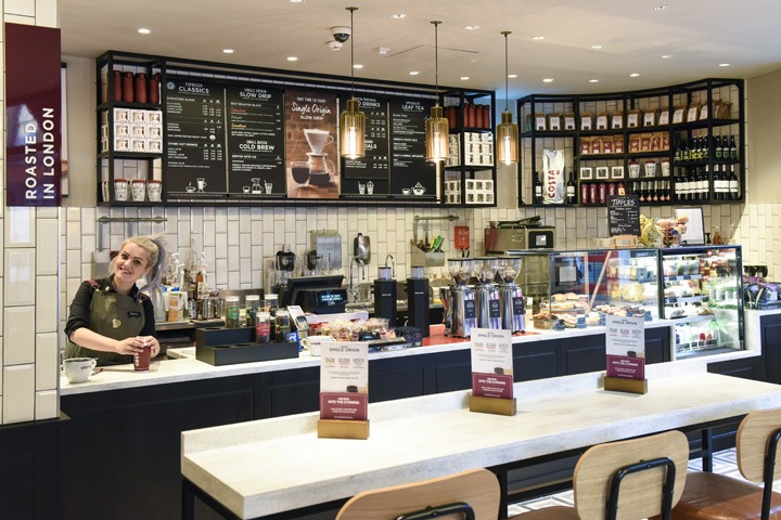
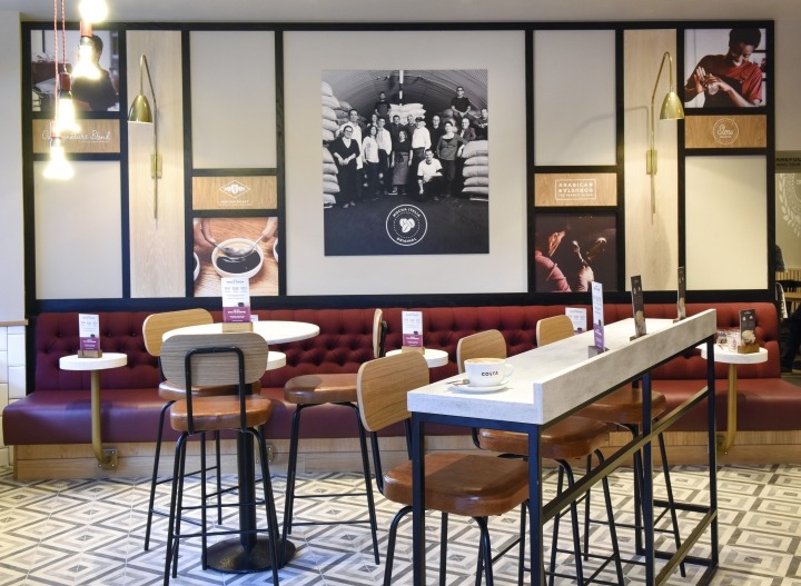
Costa Coffee’s new concept by EDGE is a minimalist’s dream. The slim gauge shelving structure behind the counter, finished in matt black whilst also curving around the edge of the space is beautifully merchandised, whilst allowing enough space for menus and signage in the centre of the display.
The finishes used in the back-wall display are testament to authentic design, using key components of the brand’s heritage mixed with light grains of wood with subtle printing, compliment the space while the black framework adds a contemporary feel.
See the full project https://retaildesignblog.net/2016/11/14/costa-coffee-by-edge-london-uk/
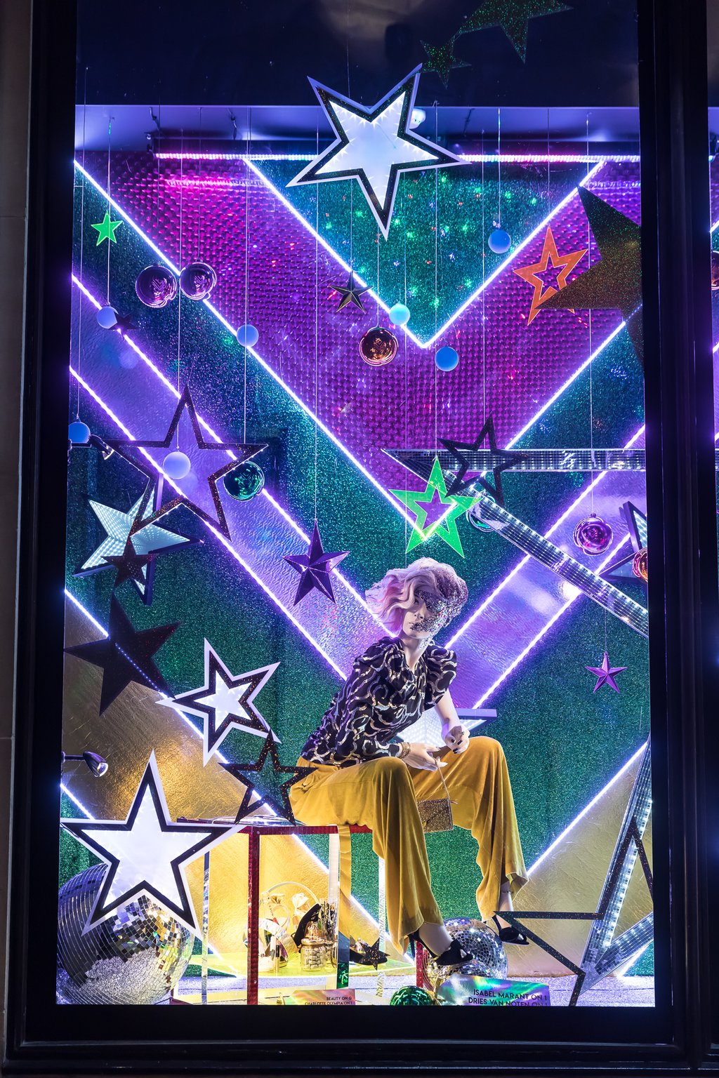
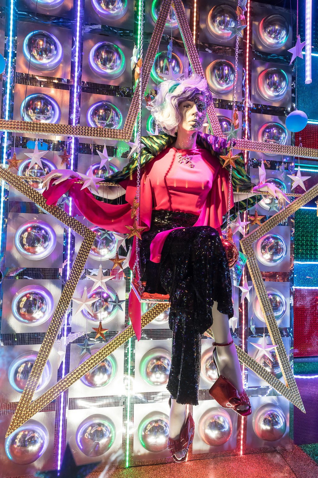
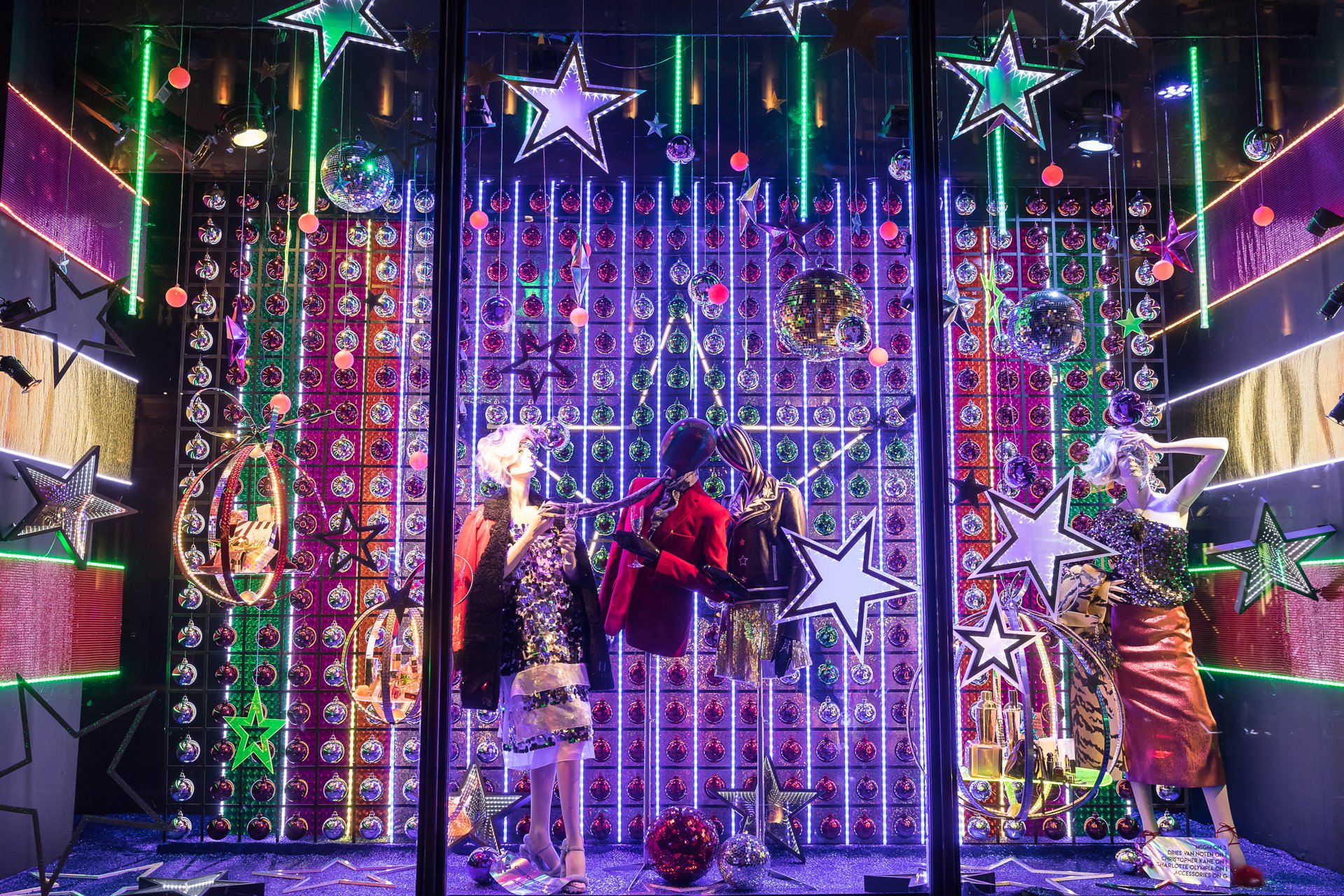
Burberry, Harrods
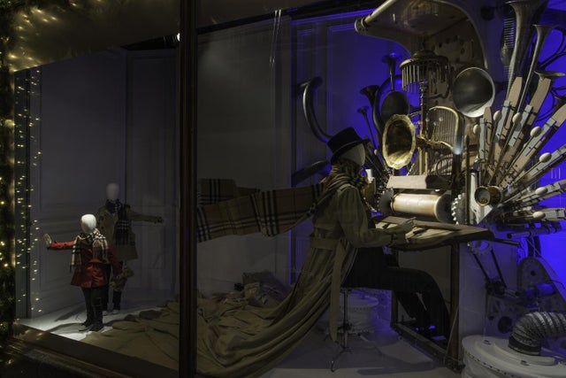
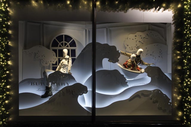
The first Christmas display we feel compelled to comment on is Burberry’s window in Harrods. Their VM team have done an amazing job of subtly introducing products into the main visual merchandising area, with the iconic pattern appearing to float in the wind.
What we particularly like, however, is the way Burberry have introduced light into their bath scene. With multiple layers of display, spanning the entire depth of the display, a soft blue light has been created to wash each of the bubble structures, providing a beautiful glow without infringing on the focused product lighting.
See the full project https://www.standard.co.uk/shopping/exclusive-first-look-at-harrods-fairy-tale-christmas-windows-in-collaboration-with-burberry-a3385571.html
Aesop, London
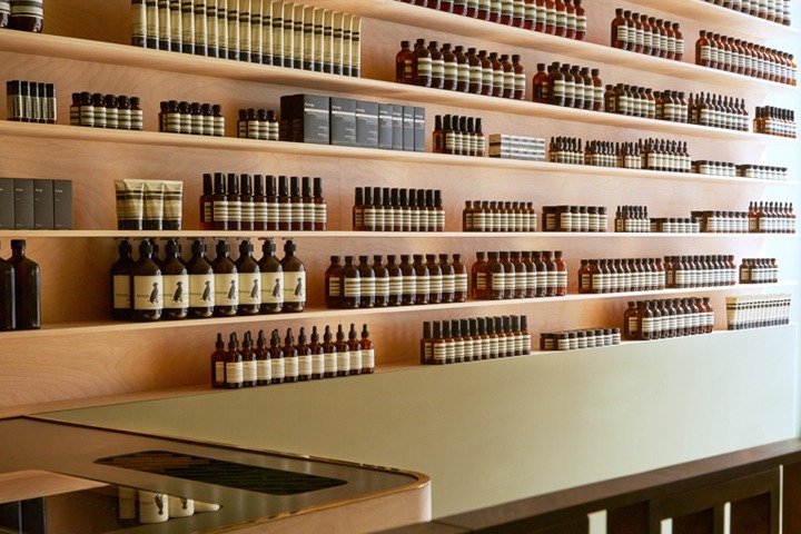
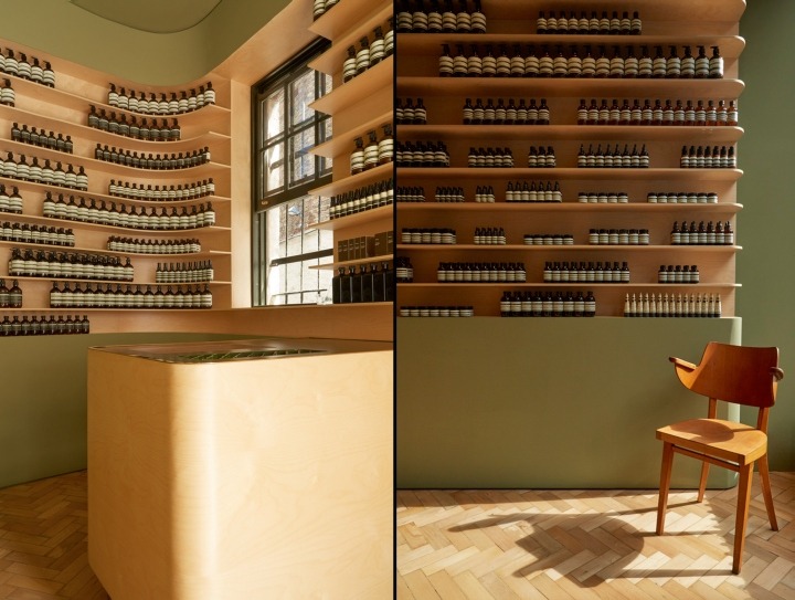
We love how understated Aesop’s latest London store is. While only occupying a small retail location, the brand have remained incredibly simplistic in their approach to signage & window display, with a single Aesop logo printed on the window and a protruding sign from the corner of the store.
Within the store itself is where Aesop’s individuality shines, as always. Retaining the colour scheme from the exterior of the building, Aesop introduce a beautiful wood grain that fits products perfectly, accompanied by the similarly light-grain flooring.
See the full project https://www.studioprototype.com/Aesop-Hampstead https://retaildesignblog.net/2016/11/15/aesop-store-london-uk/
Dalziel & Pow – Missguided
Dalziel & Pow have achieved one of the most exciting store designs we’ve seen all year, with their Missguided store launch. The space is created for a clear target audience, and the high impact signage – such as the neon slogans dotted all over the store, create a hyper trend-focused design that encourages engagement at every opportunity, seamlessly blending online & offline worlds.
The Missguided brand has been captured perfectly – fearless, fun and self-expressive.
See the full project https://www.dalziel-pow.com/work/missguided-1 https://retaildesignblog.net/2016/12/01/missguided-westfield-stratford-store-by-dalziel-pow-london-uk/
Aspinal of London
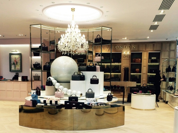
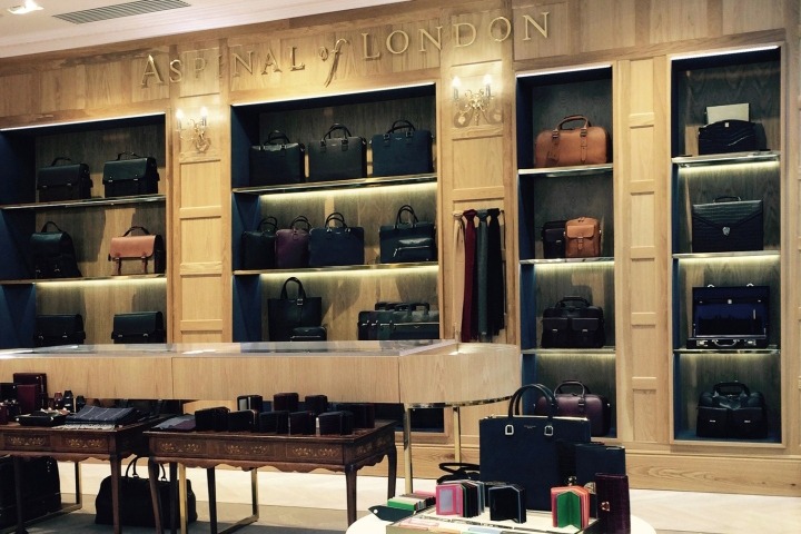
In what is a complete contrast in tone to Missguided, Aspinal of London have launched their first flagship outside of London, in Leeds.
The design of this store stays true to the heritage & authentic appeal to brand upholds, whilst introducing finishes & materials that lift the brand to modern luxury, notably the high-shine gold curved display system surrounding a handbag mid-floor unit.
See the full project https://retaildesignblog.net/2016/11/22/aspinal-of-london-by-caulder-moore-leeds-uk/
Prada
A modern take on luxury is also present in Prada’s latest flagship in Copenhagen. Chrome plated display units almost blend into the design, with polished checkerboard flooring adding a visual texture that adds to the framing effect.
We particularly like the integrated shelving used for footwear, with seemingly invisible supports built into the wall itself, which adds a touch of elegance to the display.
See the full project https://retaildesignblog.net/2016/11/23/prada-flagship-store-copenhagen-denmark/
REDValentino
This video provides insight into the world of retail design, highlighting the process architect & designer India Mahdavi went through when creating a concept for REDValentino.
Identifying the theme, colours and finishes of the store stems from the creation of a persona that embodies the brand and what the collection is attempting to convey, which results in a romantic yet rebellious mindframe.
The space itself looks amazing, with the finishes perfectly complementing each other, especially the product displays surrounding the store in their chrome gold finish, with minimal detail yet the boldness to be encompassed as part of the design.
See the full project https://divisare.com/projects/325083-india-mahdavi-redvalentino
You Are Here
You Are Here’s boutique concept focuses on the principle of being ‘over the line’, a nod towards their focus of non-conformist sportswear.
The design itself definitely supports this, with a plain white background and floor, with minimal prints being applied throughout that emulate different sporting arenas i.e. tennis courts & running tracks.
We love that the design concept has been applied fully to this space, from the detailing on the shelves to the podium-style plinth.
See the full project https://www.designboom.com/design/you-are-here-interior-design-concept-eindhoven-netherlands-06-05-2016/Photography by Daantje Bons
Fendi, Selfridges
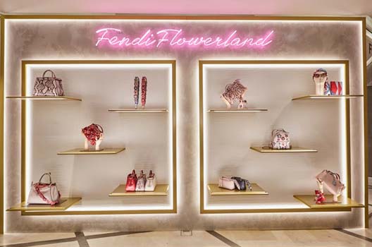
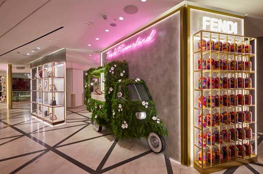
Fendi’s latest pop up in Selfridges was based on a Flowerland theme, and created a compact, yet highly visible environment for visitors.
Greeted with multiple neon signs, one based on the Fendi lego and the others utilising handwriting style font above the main displays, the effervescent glow neon is famous for attracts attention immediately, especially when combined with the backlighting of the shelving displays.
Speaking of the shelving displays, we love how each one has been individually treated. The first, a more traditional matrix of products and gold chrome framework, with lighting applied in each section highlights each product individually. The second, and higher impact display (in our opinion…) utilises lighting to frame products, with perimeter lighting drawing attention to the area, whilst individual ‘floating’ shelves highlight key products.
Learn how to create brilliant neon signs & displays
WS2
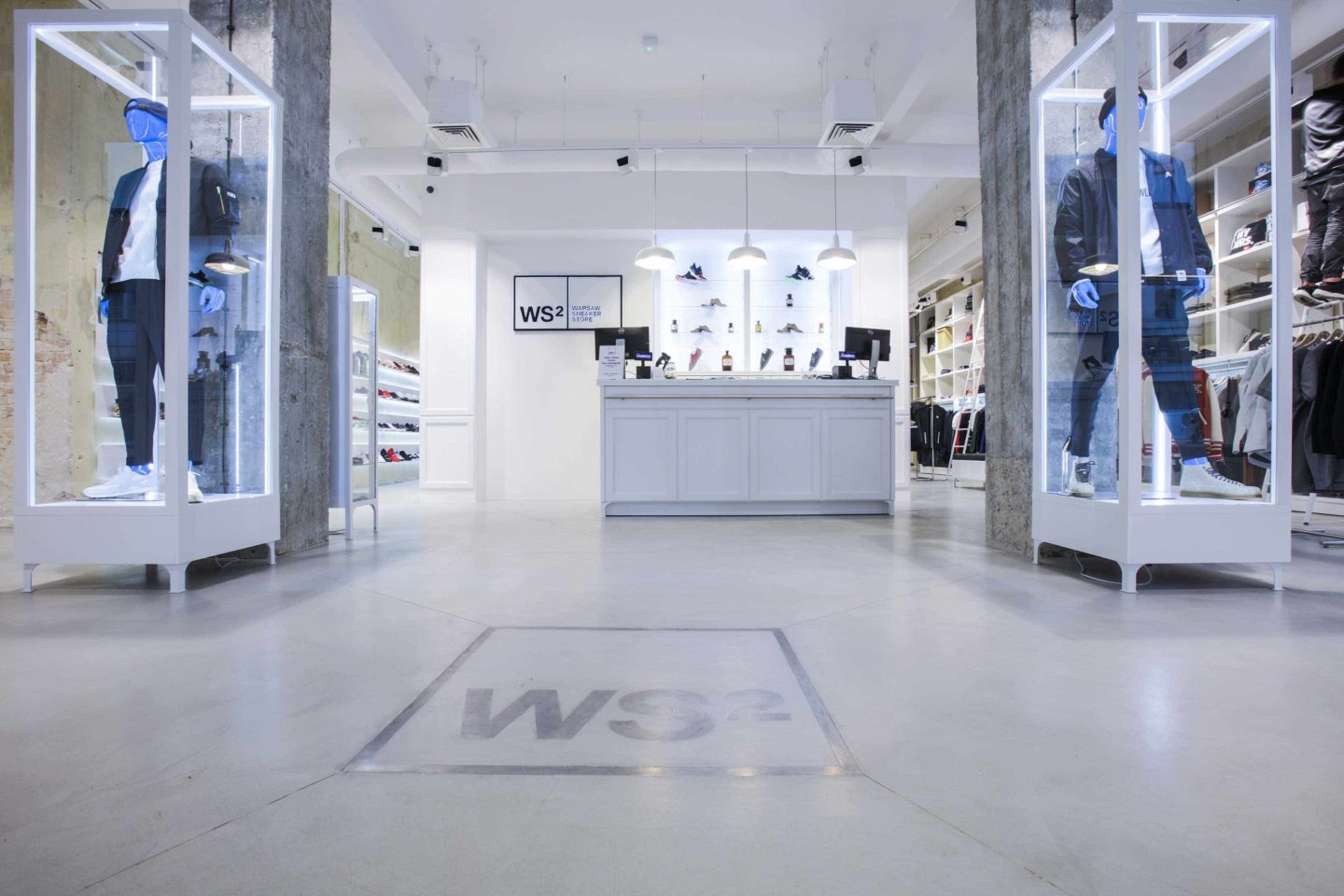
WS2’s new store in Poland created the store design around making products as visible as possible. This sounds like an obvious tactic, however, by implementing mostly white fixtures and display systems, the eye is immediately drawn to products.
In particular, we love the two showcases that have been installed alongside the two main pillars of the store. The white powder coated framework works brilliantly against the authentic concrete finish to the pillars, and the integrated LED lighting ensures that the full mannequin is illuminated. The full-scale LED lighting frames the products from all angles, and creates a clear focus point when walking into the store.
Lukstudio
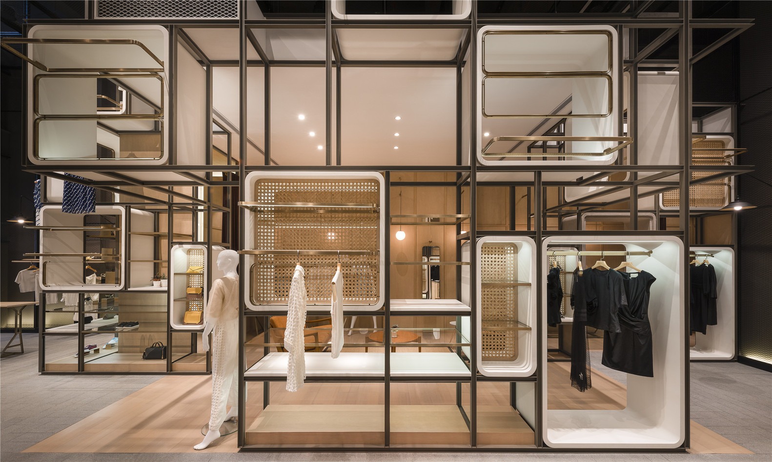
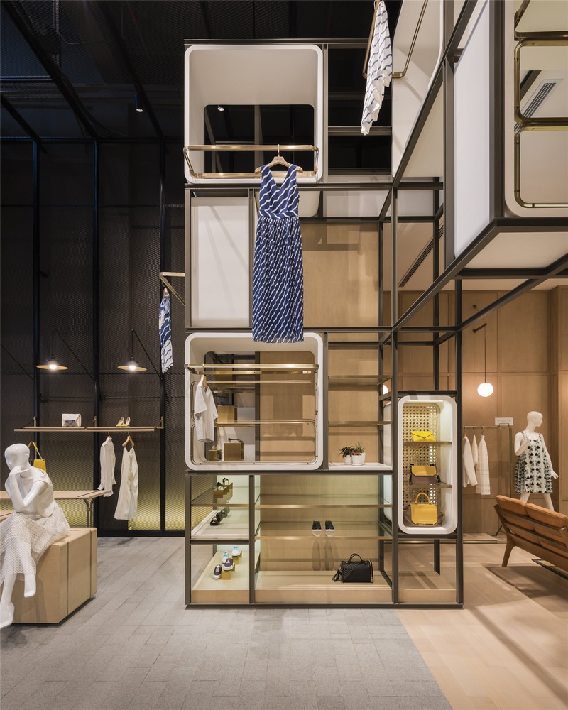
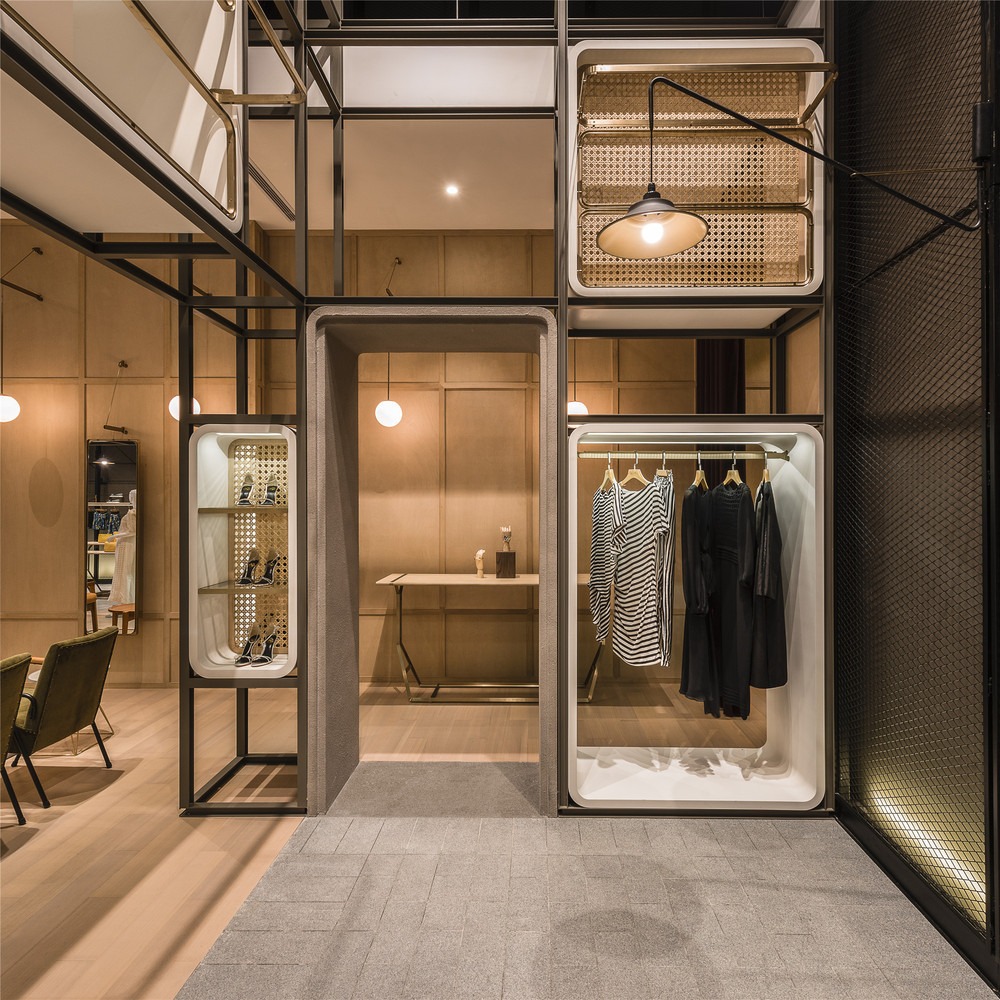
For anyone that doesn’t know – we have a small obsession with retail frameworks. Lukstudio have created a brilliant example of how to implement a unique retail framework, by creating custom inserts for each area of the display.
The framework itself takes a backseat in terms of visibility, with a dull grey finish applied. However the white inserts and shelving displays are coupled with gold chrome hanging rails & fixtures, which makes them instantly more visible and helps visitors identify areas of the display.
We also love how lighting has been applied in store, with a subtle wall-wash effect being applied to the exterior, and a brilliant integration of lighting into the white display system inserts, ensuring products are highly visible and no shadowing is created from the insert itself.
See the full project https://www.lukstudiodesign.com/portfolio/the-modular-lilong/ https://www.archdaily.com/793215/the-modular-lilong-lukstudio Photography by Dirk Weiblen
Stone Island
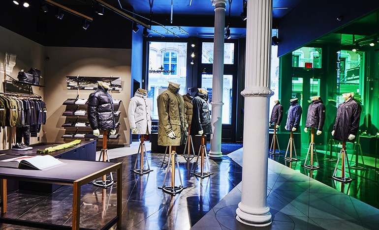
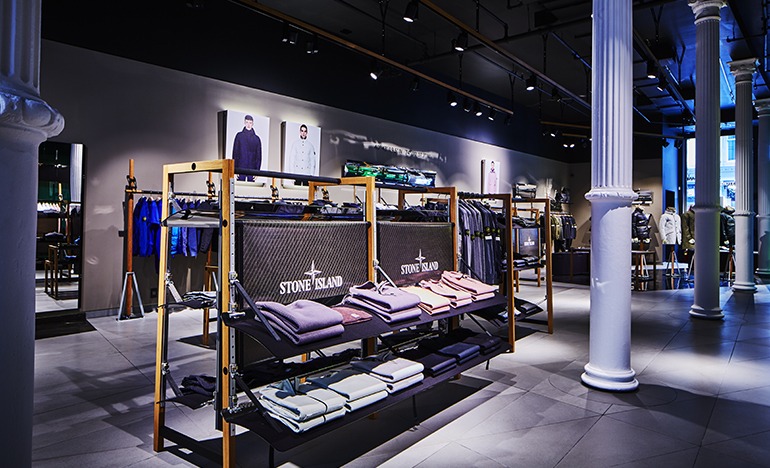
Stone Island have launched their NYC flagship store, and the result is incredible. We’ve been talking about the concept of authentic retail design for a while, and this store perfectly blends the authenticity of its surroundings, with the modern elements needed to keep the store on-brand.
The first thing we noticed were the mid-floor units, created with a beautiful dark grain of wood and a clever integrated brand/graphic display. Each of the shelves within each unit are suspended by belts, that clip into the wooden uprights – which is a clever way of making the units multifunctional and suitable for various products as the store remerchandises.
Stone Island approach mannequin displays with their unique twist, creating bases for wooden uprights, with each mannequin placed strategically throughout the floor space.
We also love how pillars have been introduced throughout the store. These are present from the window displays & entrance, and are one of the more natural elements added to the store, that help create a unique experience.
See the full project https://www.stoneisland.com/experience/en/the-stone-island-store-new-york/
Sonos
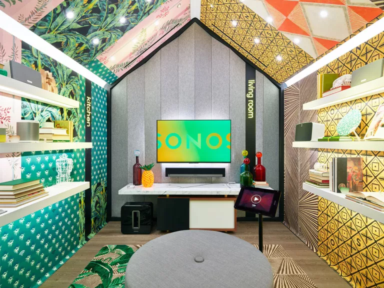
Whilst we’re on the subject of NYC flagships, Sonos have launched their latest store with innovative methods of recreating home environments for the ultimate product demos.
Songs called these ‘Sound Rooms’, with each one individually styled with suitable props, but more impressively – with custom lighting to create the right mood setting for each environment. With each room being expertly sound proofed, they allow visitors to see how the Sonos system works throughout the home.
Creating an experiential area such as this helps to create an engaging visitor experience, allowing them to interact with products in the situation they’d normally use them. This is clever store design by Sonos, that makes great use of the limited space they have available.
See the full project https://www.wallpaper.com/design/sonos-opens-a-ground-breaking-flagship-store-in-nyc
Feuille
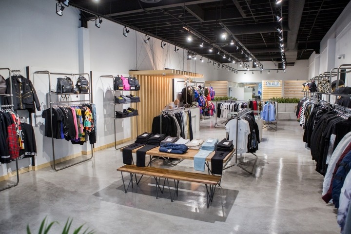
In their own words, ‘Inspired by the veins that provide structure and shape to a leaf, Feuille’s basic geometric forms juxtapose natural foliage against industrial urban street finishes’. This makes for one of the most interesting store layouts we’ve come across, particularly when put into perspective from the window display right through to the sitting rooms.
The contrast between the use of wooden finishes and the natural concrete finish flooring makes the mid-floor units and till points stand out, whilst the lightweight framework for the product display system is perfectly designed for cross-selling clothes with recommended accessories.
We also love the under shelf lighting on the shoe & accessory display, as each product has its own direct light source. Often this type of display suffered from shadowing, but Feuille have created a system similar to our Kontakt Shelving System, that illuminates from the shelf itself rather than an external light source.
See the full project https://www.cutlerdc.com/work/feuille-vancouver-bc/ https://retaildesignblog.net/2016/07/21/feuille-store-by-cutler-vancouver-canada/ Photography by William Luk
Dyson
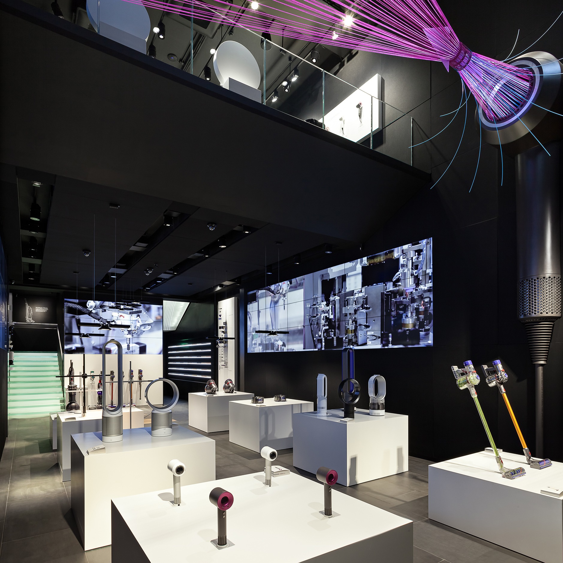
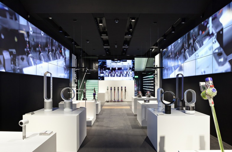
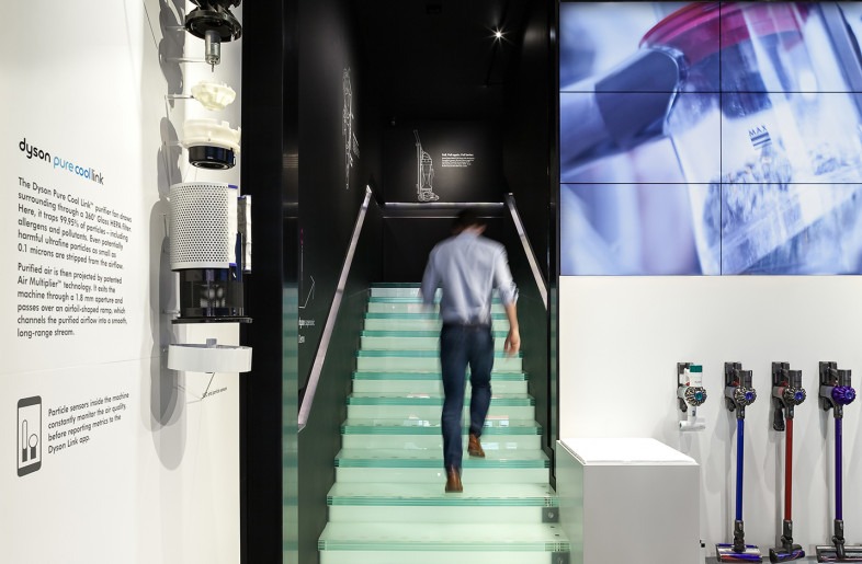
Sir James Dyson & Wilkinson Eyre collaborated on Dyson’s new concept, a demo store based in London. This is a really interesting move for the company, as products have been glamourised akin to the way Mr Jobs revolutionised mobile phones (we love both – just for the record). Dyson are using a variety of display technologies to help visitors understand why Dyson are a premium brand, and look to be doing a great job.
Firstly, the simplicity of the product demo stands let the products take full focus. They’re design pieces themselves, some with added colour, some without – both look equally at home on the matt white finished plinths.
The displays truly start to become interesting when you notice the huge screens either side of the narrow space, detailing the manufacture of components and the intricacies involved. These are backed up by wall mounted displays with each product exploded (in terms of components, not the fire kind), and line drawings surrounding the stairs of each model.
The brand is portrayed perfectly, advocating the technological prowess that Dyson would want to get across to visitors, whilst also creating an engaging experience in store.
See the full project https://www.wilkinsoneyre.com/projects/dyson-demo https://frameweb.com/project/dyson-demo-oxford-street
Total Sports
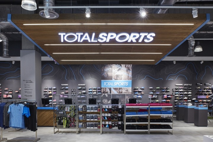
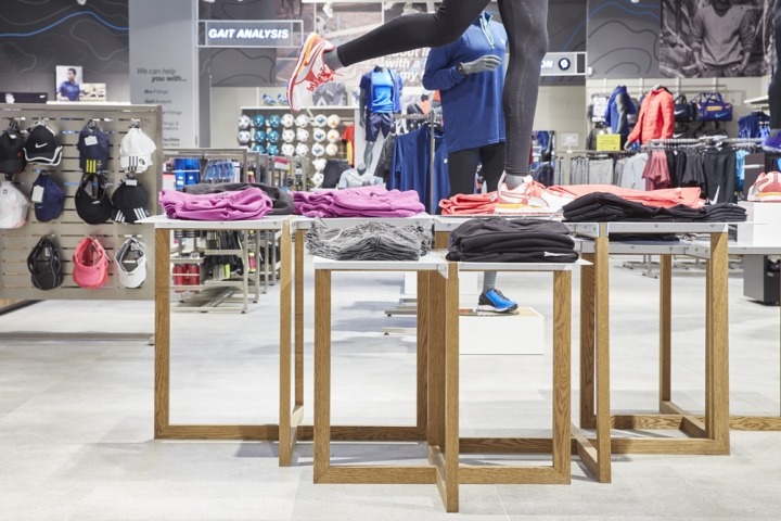
As far as sports stores go, Totalsports latest concept is a brilliant example of retail design. One of the clear themes that hits you when looking at the store is how well the brand comes across, in an elegant, minimalist way. The illuminated logo has been cleverly designed to be seen at a slight angle, providing a focus point for shoppers, directing them towards the till points. We know from experience that creating this type of LED signage, that matches brand guidelines exactly, isn’t easy to create but looks incredibly effective on a large scale.
There are examples of clever uses of illumination throughout the store, but the one that caught our eye was how each area of the store is signposted. Using neon-style illuminated lettering mounted onto a mesh back panel, a consistent approach to signage is created, which complements the store design as well as helping shoppers identify different areas. We particularly like how these signs haven’t all been mounted onto the wall itself, but some extend horizontally out whilst retaining the clean look.
Finally, the way Totalsports have introduced a variety of finishes, including light grain woods and white metal frameworks creates an environment that isn’t as masculine as traditional sports stores, making the store more approachable.
See the full project https://retaildesignblog.net/2016/07/12/totalsports-store-by-tdcco-midrand-south-africa/ Photography by Graeme Wyllie
Gentle Menswear
Stunning framework mixed with illuminated product displays make Gentle Menswears’ store one of our favourite concepts. Utilising a clean matt black framework mixed with monochrome finishes surrounding the product displays creates an elegant look & feel to the store.
Lighting is an incredibly important aspect of this type of retail environment, with a unique approach being taken in this store. In addition to the standard spotlights in the ceiling, lighting strips have been integrated into the framework itself, which when combined with diffusers mounted at a slight angle, direct light perfectly onto the clothes hanging beneath. This also inadvertently highlights areas such as the mid-floor units, which otherwise may not be as effective.
Whilst we’re on the subject of lighting, we love the subtle ‘halo’ illumination surrounding the plinths and product displays. It provides great contrast between two darker finishes for the floor and plinth displays themselves.
See the full project https://retaildesignblog.net/2016/07/12/gentle-menswear-store-by-ac-studio-wenzhou-china/
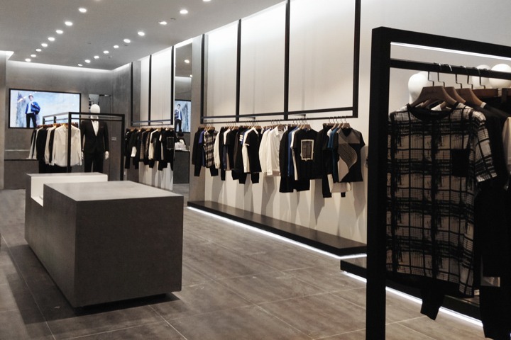
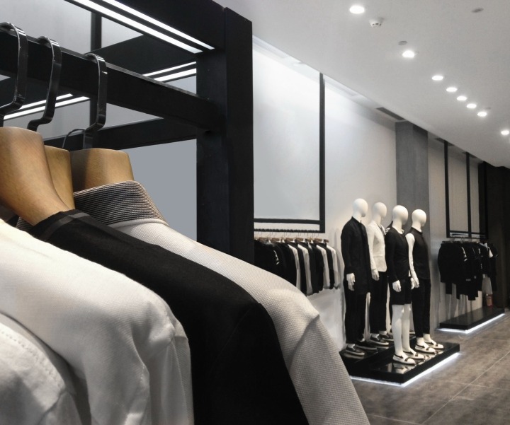
Bleacher Report – Neon & Modular
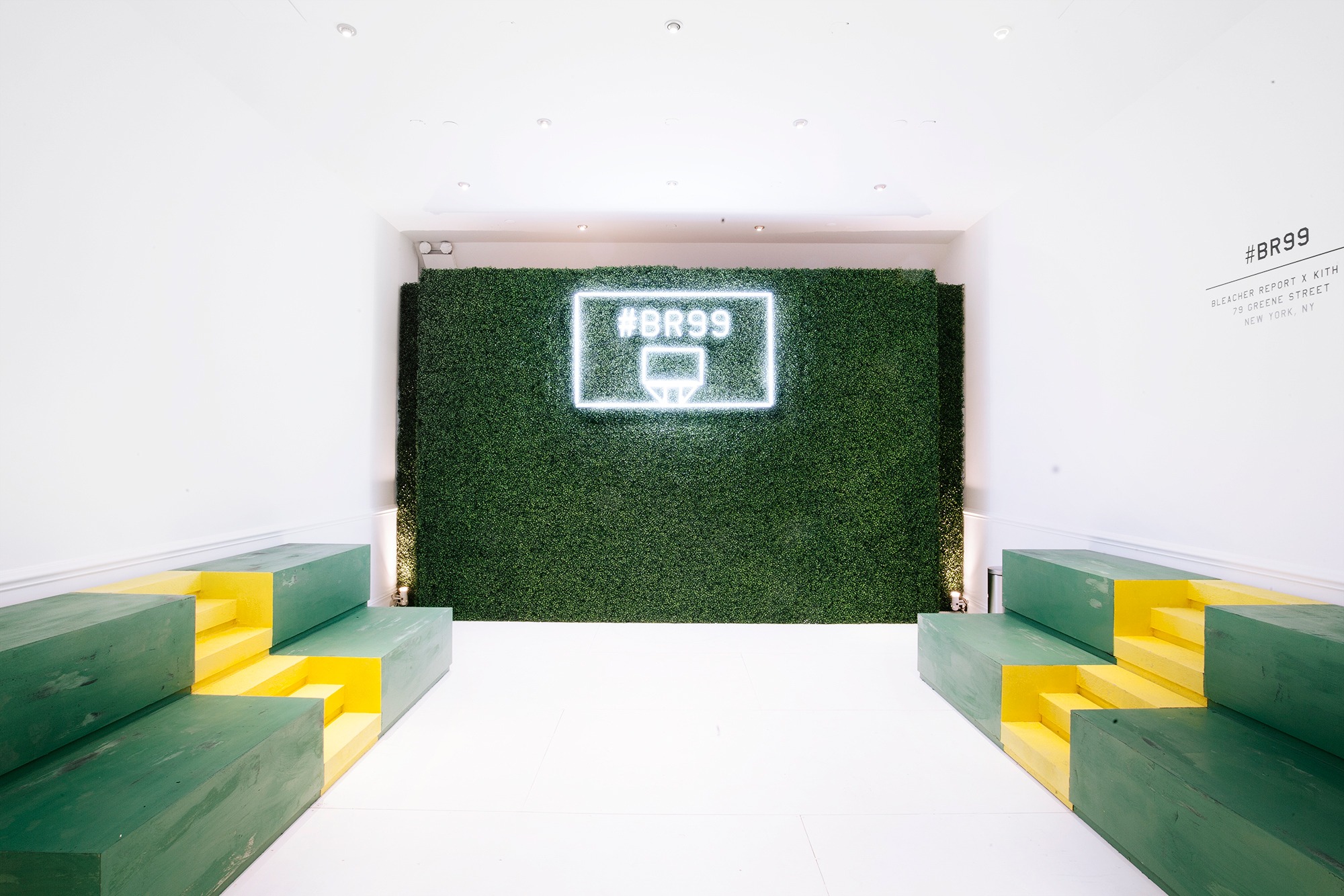
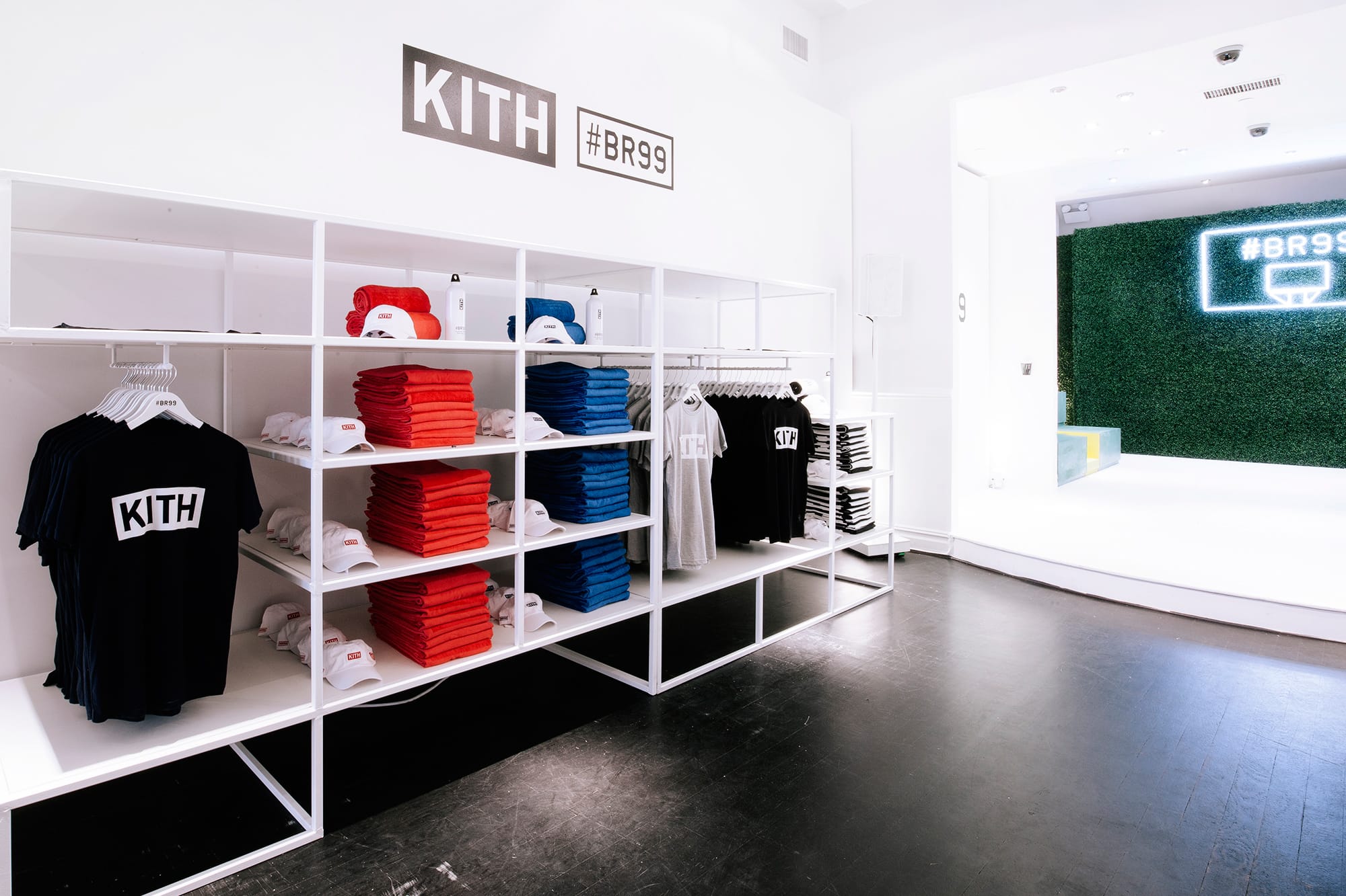
In case you missed out, we’ve been pretty vocal about the renaissance of neon, and how it keeps cropping up in retail locations, from indie pop-up’s to multi-nationals. As it’s tennis season, we loved this concept created by Bleacher Report at Kith, in NYC. The astro-turf mounted onto the back of the store, as well as added to the product display plinths, creates an extra dynamic in store. It works incredibly well considering the contrast between the turf and the white interior of the store, and provides a brilliant backdrop for the neon sign – highlighting the glow of the lighting.
Complementing the products and staying true to the design aesthetic of the store, the white product display system looks amazing next to the black floors, and also highlights the colour of the products. The modularity of this display is what makes it look great, with a single bay to the left, followed by two variations of double bays, this system looks perfect for short-lived pop up stores such as this one.
Learn more about Neon Lighting & Modular Display Systems.
Source https://hypebeast.com/2016/6/bleacher-report-kith-br99-pop-up-shop
Valentino – Authentic Retail Design
We couldn’t go without mentioning Valentino’s new store in Japan. Again, a focus of ours lately has been materials, particularly the use of authentic and natural materials to create unique shopping experiences. Valentino are no stranger to this, and have mixed the latest trend with modern light fixtures and shelving displays to create a high class retail environment.
The showcases, covered in a wooden finish with integrated lighting look great next to the handbag shelving display, which again have their own lighting source, but are also focused on by ceiling hung spot lights, that create clusters of light around each product bay. The contrast between the finish of both the shelving & showcases, and the mosaic style flooring makes each product display stand out.
See Kontakt – our moveable illuminated shelving solution.
See the full project https://retaildesignblog.net/2016/07/04/valentino-flagship-store-by-david-chipperfield-architects-tokyo-japan/
Botanist Bar
Sticking with the same theme of modular frameworks – this ceiling display with integrated lighting looks amazing. Although strictly not a retail concept, using a framework in this way would provide a perfect environment for product display, possessing the structural qualities for merchandise, whilst being able to surround certain areas in light – focusing customer attention.
The ability to create this kind of look in retail isn’t far off becoming a reality, as the trend for slimmer gauge frameworks is pushing the boundaries of LED integration.
See the full project http://www.albertocaiola.com/work/botanist/ https://retaildesignblog.net/2016/07/06/botanist-bar-by-alberto-caiola-shanghai-china/ Photography by Dirk Weiblen
Nike – Millington Associates
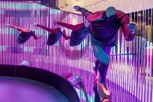
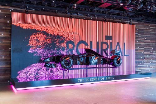
One of this weeks stand-out retail projects was Millington Associates Nike store, in London. What we particularly love is the integration of movement, which is apparent in many of the sections throughout the store. The first example of this greets customers as they walk in, with an F1 car seemingly hovering in mid-air, backed by an animated wall with dynamic messages appearing. The movement is incredibly well thought out, and the transitions between each clip gives you the desired sense of speed.
A showcase of their commitment to speed, Nike created a dedicated area to the new Mercurial boot, featuring vertical linear programmable LED’s that display moving messages around the entire area of the display.
Photography https://www.millingtonassociates.com/
SFD
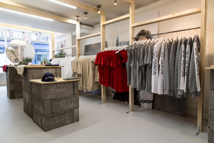
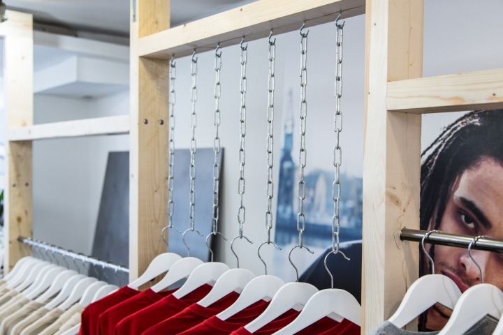
Next up is SFD’s partnership with Serge DeNimes, creating a new pop up store for their latest streetwear label. This store design stays true to the pop-up ethic, using authentic materials that you often don’t come across in larger flagships & corporate stores. The first thing we noticed (it’s hard not to!) was the breeze block stands, with a plywood finish top for displaying products. It’s a simple idea, but in contrast to the minimal decoration in store, creates a clear focal point for the whole store.
We also love how the hanging displays have been created, using untreated wood and materials such as chains to hang clothing. Again, a simple idea that looks incredibly effective. All elements of the store combine to create a unique retail experience.
See the full project https://retaildesignblog.net/2016/06/27/serge-denimes-pop-up-store-2016-by-sfd-london-uk/
Selfridges
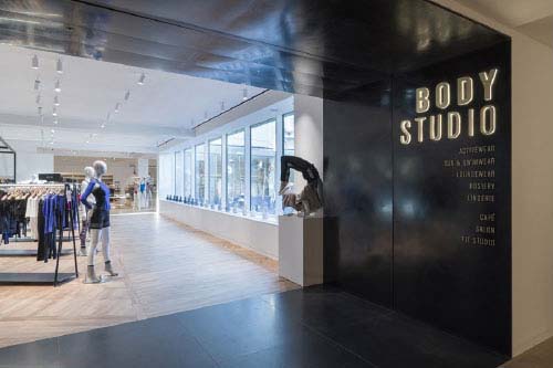
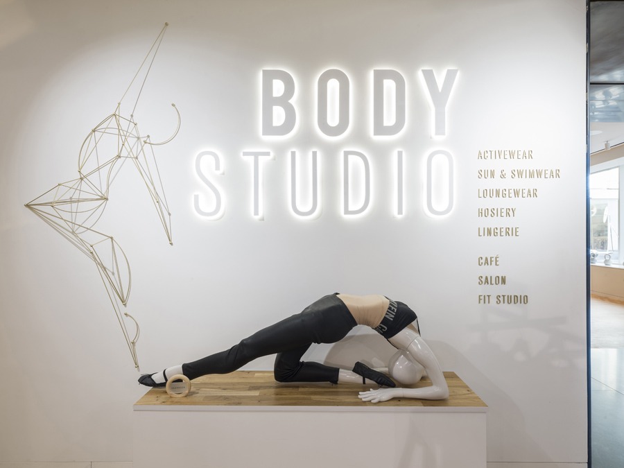
Selfridges have created a new concept, the Body Studio, designed for womenswear that’s worn directly next to the skin (think luxury under armour/body compression & fitness). We immediately noticed strategically placed illuminated branding, designed specifically for the new department. Each illuminated sign is placed directly next to the product categories on display on each floor, acting as a wayfinding point in a minimally designed space.
This is a great way to capture attention, and looks amazing. We love the contrast in font weights, and the halo that the illumination provides around each letter. Displays like this aren’t limited to simple typefaces, we’ve worked with the likes of Barclays, and even created similar illuminated lettering for our own exhibition display at the Retail Design Expo.
See the full project http://www.neriandhu.com/en/works/the-body-studio-at-selfridges https://www.frameweb.com/article/selfridges-taps-into-a-fast-growing-lifestyle-sector-by-placing-wellbeing-on-the-retail-agenda Photography by Andrew Meredith
Levi’s Concession Display
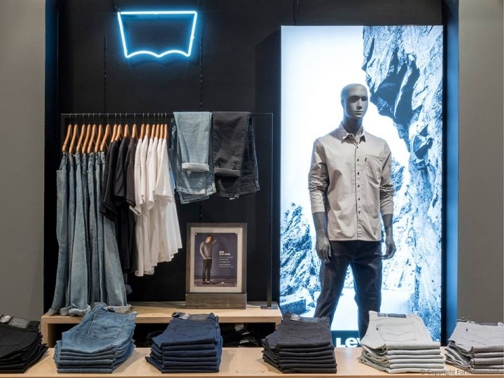
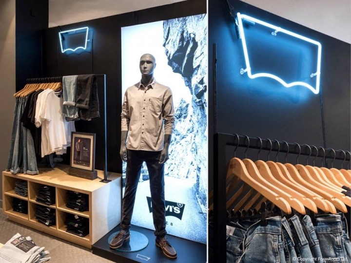
Formroom have created a simple, compelling concession display for Levi’s, that’s been rolled out into House of Fraser stores throughout the UK. Our attention was immediately drawn to the neon silhouette of the Levi’s logo, which is both testament to the strength of Levi’s brand, but also showcasing how effective neon displays can be used in a retail environment.
Coupled with the portrait lightbox, which subtly blends with the denim colours on sale, creates a clear focal points throughout the whole concession display itself. The clean, minimalistic nature of the stand, which includes the use of a single, slimline black rail which merges into the darker back-panel, ensures full focus is on the products whilst creating an on-brand concession display.
See the full project http://glamshops.ro/reviews/levi-s-house-of-fraser-concessions-by-formroom https://www.formroom.com/work/
Tate Modern Store
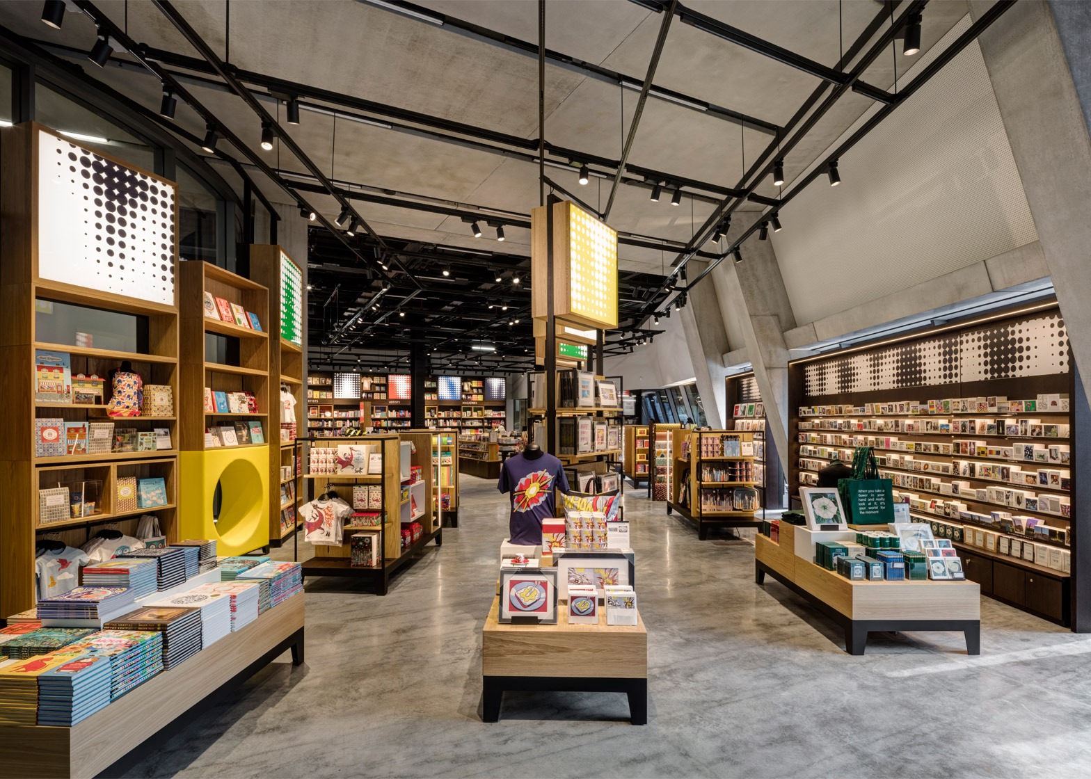
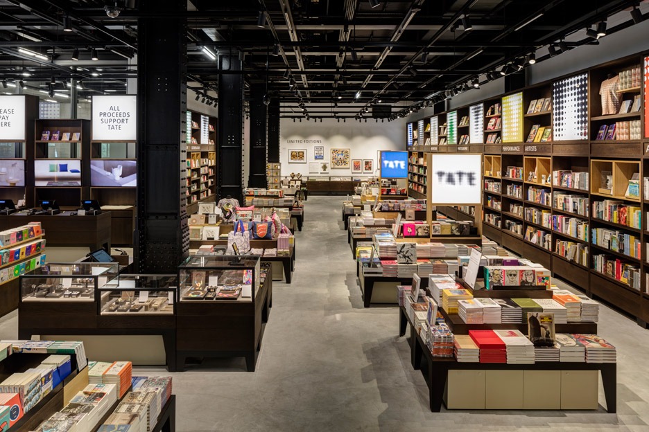
Tate Modern’s shop has been extended and designed by design agency UXUS, who have completed both a fantastic and intriguing project. The space is classed as ‘permanently temporary’, with the flexibility to respond to the gallery’s fast-changing exhibition and project schedule.
The display elements we particularly liked however, were the integrated lightboxes/illuminated graphic displays. Their use is the perfect example of complementing designs & overall store aesthetic, with Tate’s unmistakable dot pattern graphics added to high level signage – as well as lightboxes being used to highlight key areas throughout the store i.e. checkout points & statements.
An added level of complexity is added, with these illuminated graphics mounted within various finished displays. Some are integrated into the store fixture system itself, whilst others are mounted at the top of freestanding shelving displays. This use of illumination & graphics throughout the store creates an incredibly strong brand presence, and an engaging journey for visitors.
See the full project https://uxus.com/project/tate-modern-new-extension https://www.dezeen.com/2016/06/14/uxus-design-permanently-temporary-gift-shop-store-herzog-de-meuron-extended-tate-modern-london/
ROC Mondriaan
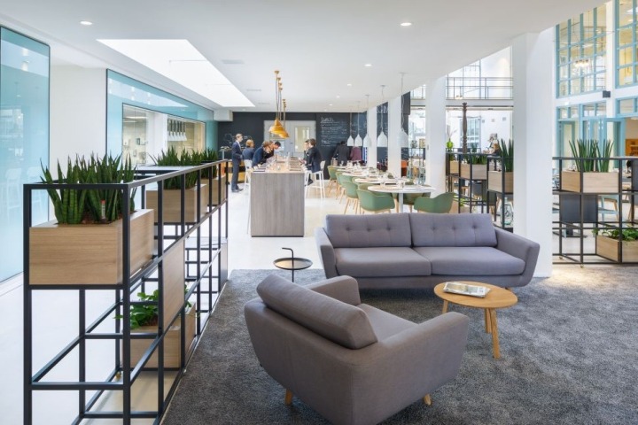
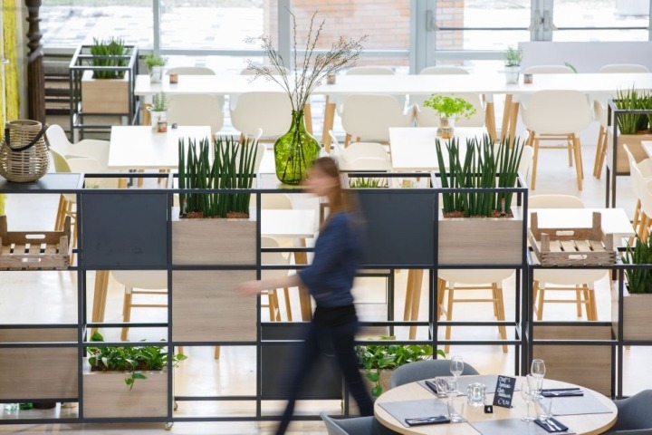
We’re used to seeing a whole host of ways modular systems are used in the retail & event space, but this one caught our eye. ROC Mondriaan in The Hague have opened a new hospitality campus, incorporating minimalist partitions to break up each space within the open plan area.
Using a slimline display system, ROC Mondriaan have used the free space between each framework section to add different finishes to infill panels, in addition to slightly taller plants that create different perception of depth, in an extremely elegant fashion.
One of the challenging aspects about this installation was ensuring the space retained its open & airy feel, something design agency Fokkema & Partners achieved by using well spaced infill panels – allowing space in-between each section, alongside the use of low level/spaced plants that allowed light to travel through the leaves, providing enough privacy for guests sitting in the dining area.
See the full project https://fokkema-partners.nl/projects/roc-mondriaan-hospitality-campus/ http://retaildesignblog.net/2016/06/19/roc-mondriaan-hospitality-campus-by-fokkema-partners-den-haag-netherlands/ Photography by Horizon Photoworks.


 White on Black")

